
Points of Impact – Week 10: Switching Tracks
![]()
May 2012 – Week 4
It’s Saturday again! Not only does this mean another morning of chowing down some sugary cereals while watching cartoons, it’s also the moment for some new Points of Impact! Yes, it’s the column that lets you buy the cereal with the marshmallows in it! We’re so much cooler than your mom!
Again:
- The BULLSEYE! section presents something that really wowed me. That’s usually when a writer does something unique among his peers.
- The HIT! section picks up on a cool trick that gets used pretty often – mostly because it works – but of which I’ve found a prime example.
- The MISS section however isn’t about praising a good shot but – as you guessed it – pointing out where a writer stumbled so you don’t put your feet in the same hole.
Keep in mind: this column is extremely spoilerible! Go! Read your comics! Then come back!
BULLSEYE!
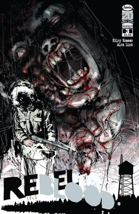
The multi-track narrative in Alex Link and Riley Rossmo’s REBEL BLOOD #3
 Plot: Alex Link and Riley Rossmo
Scripter: Alex Link
Art: Riley Rossmo
Letters and color assist: Kelly Tindall
Edits: Laura Tavistati
Brains: Jim Valentino
I’m always on the lookout for those occasions when writers will break out of the routine of lining up one panel after the other in that tested yet predictable fashion that consists of ordering the whole narrative as if it was a video playback: one thing happens, then another, then we see what happens next. This often reduces the artist to the role of a simple cameraman after the fact, reproducing the events as they strictly happened and nothing more.
On the contrary, I rejoice when writers take a chance and shake up their narrative, cutting it up, switching viewpoints, travelling through time and showing us a glimpse of how their characters see the world instead of how a passing camera crew captured it. REBEL BLOOD #1 was such a grand occasion with its use of hypothetical scenes. It’s thus a very fitting repeating of history that on our tenth article milestone, we revisit the title that earned the first BULLSEYE here on ComixTribe.
In REBEL BLOOD #3, our “hero” Chuck goes to the rescue of his colleagues Red and Mike at the “Regional Forestry and Fire Service” building. After confronting a horde of zombie rabbits (no, I’m not making this up), Chuck steps into the building and the flashback gates open…
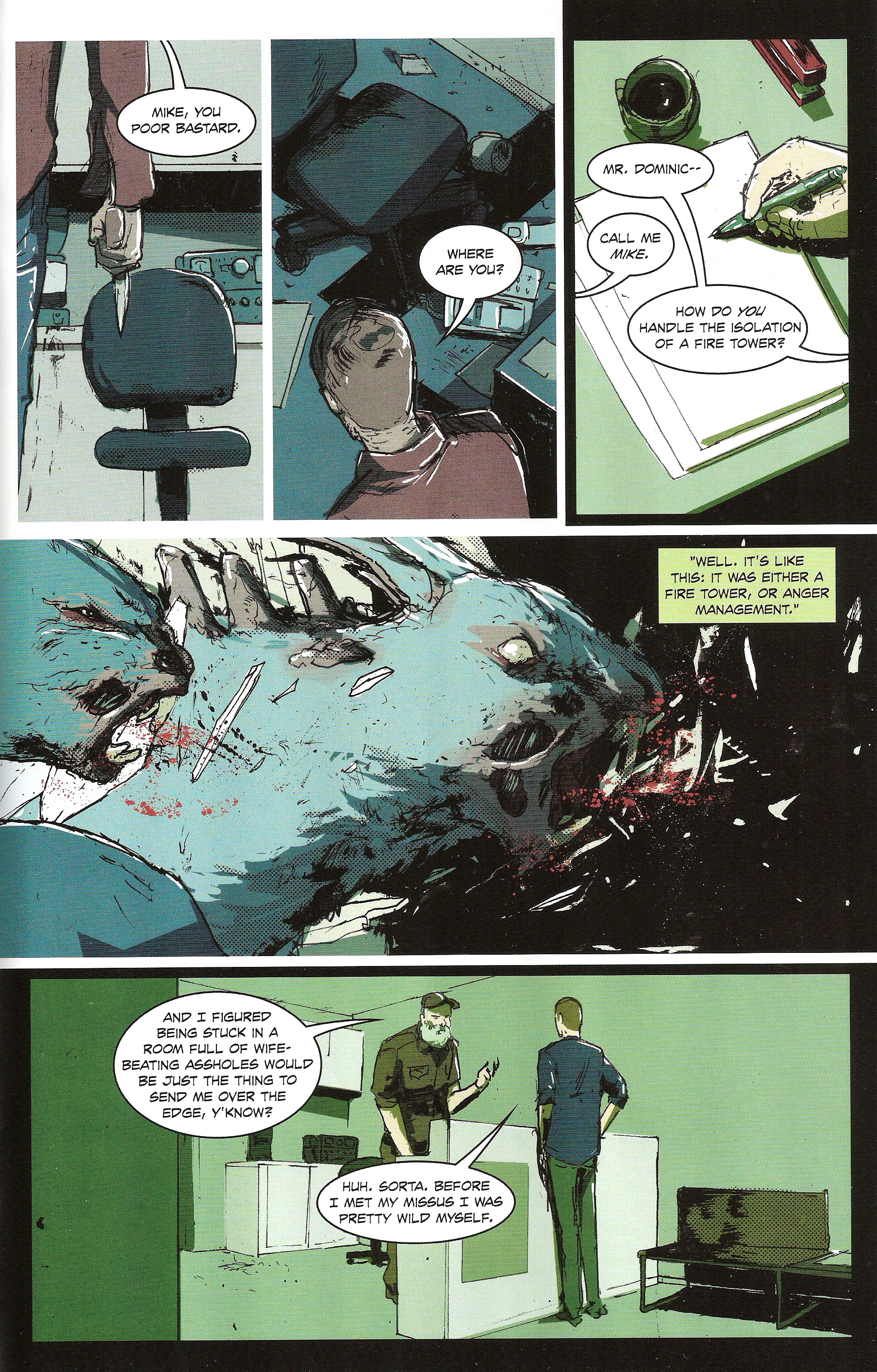
For those who recall that very first Points of Impact, you’ll recognize the black-bordered green-tinted panels that denote that the action is taking place outside the flow of normal time. In REBEL BLOOD #1, it was used for the hypothetical scenes; here, they’re being used for flashbacks. This particular flashback takes us back to the time when Chuck signed up to be a forest fire ranger, meeting the man whose life he’s trying to save at the moment. Notice how we go from one flashback panel (panel 3) to a present-time panel and back to another flashback panel. However, even though we switch back to the present, the “past track” is still playing in the background: the conversation is continuing in a voice-over caption even if the image shown is that of the zombie rabbits (“zombunnies”?) getting inside the building after Chuck.
In this instance, we’re actually following two separate tracks simultaneously: the past track and the present track. We’re not switching from one to the other per se since – as panel 4 shows it – we can still follow the events in both tracks at the same time: the intruding long-eared ghouls being part of the present and the dialogue part of the past. By splitting up these two components between two tracks and yet showing them inside the same panel, Link and Rossmo succeed in advancing their narrative on two separate timelines. The end result is an enriched storyline without the cost of a higher panel count. If you need less panels, you get more space for the art and thus more opportunities to set up atmospheric shots.
The next page offers us more of the same goodness, albeit with a slight twist…
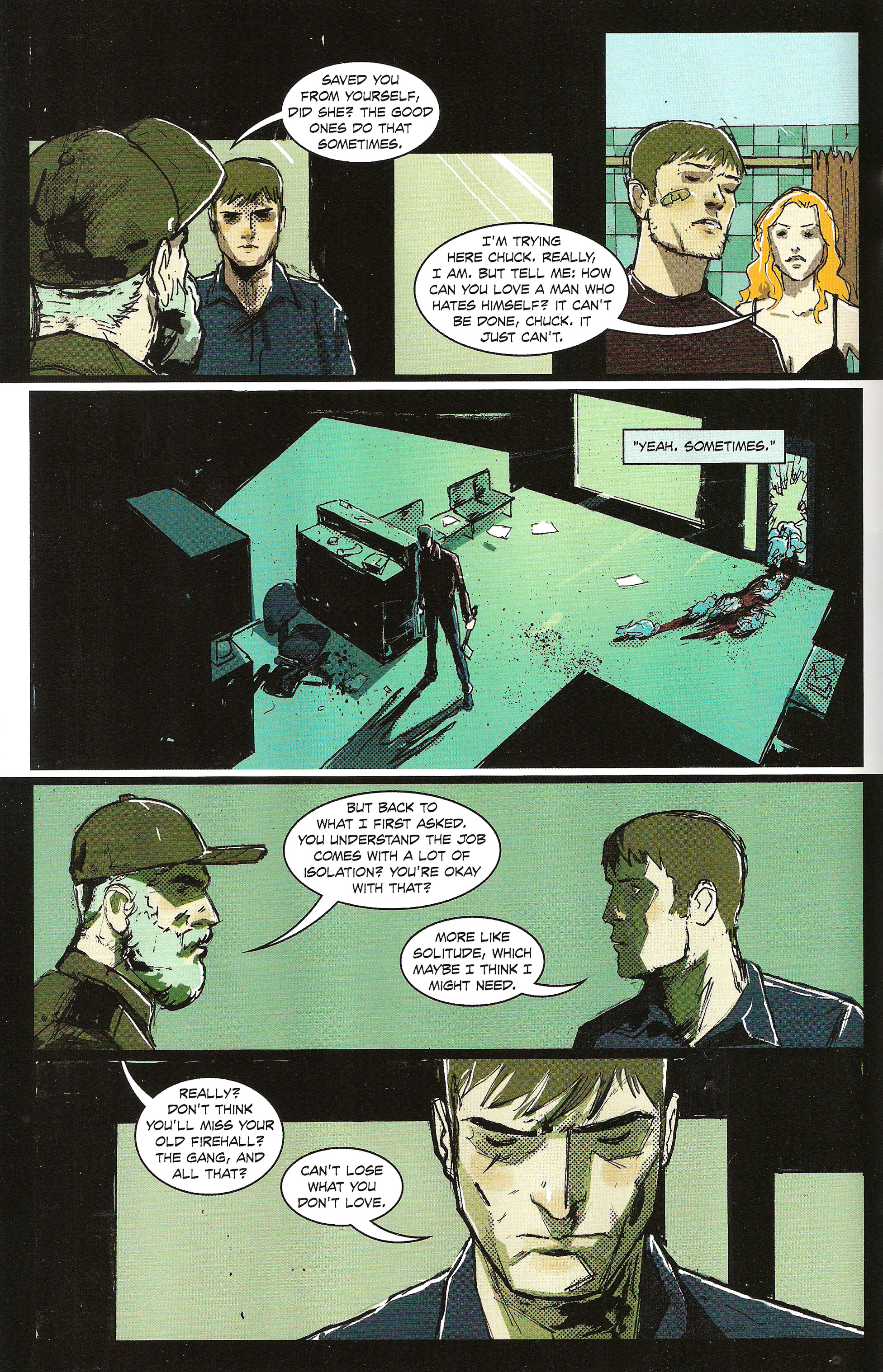
Here the flashback takes up most of the page with only panel 3 breaking up the flow and taking us back to the present (with killer zombie bunnies!). There’s also one new element: there’s a panel that’s part of an entirely new track, this one taking place even before the meeting between Mike and Chuck. Yes, it’s a flashback within a flashback. That makes another narrative track that runs parallel to the others, if only for the space of a single panel. Its effect however is palpable as it adds another layer of meaning to the exchange between Mike and Chuck, the same way that exchange already added another layer to the rescue the latter is mounting to save his colleagues.
The entire purpose of these flashbacks is of course to allow us to delve deeper into the character of Chuck, making him more complex than just a guy running away from zombies. At the same time however, because of the way the flashbacks are presented, it’s possible to explore these past moments in time without stopping the flow of the main narrative. Also, as we’ve seen on the second page, with clever enough transitions, it’s possible to add additional layers by playing yet another track side by side with the others.
What we have here in essence is a very elegant solution to the age-old conundrum of advancing plot versus revealing character. This is often perceived as an either/or proposition: either you spend panel time telling your story or you use it to present your characters’ personalities. Of course, most writers try to conjugate these two goals to varying degrees of success. At the best of times, character is revealed organically through dialogue and actions that advance the plot. Failure to do so however results in the pitfalls known as purely plot-driven plots (when only the story is subject to movement, not the characters), arbitrary character traits (when we’re told the character is this way yet never shown), abusive exposition (where we’re mostly told the story instead of seeing it) and talking heads (where there’s only characters standing around and no plot to speak of).
Thus it can be said that by successfully managing multiple simultaneous narrative tracks, Link and Rossmo succeed in creating a deeper and richer overall narrative, without having to sacrifice plot on the altar of character, or vice versa.
All in all, it’s a very efficient way of writing.
Lesson Learned
When writing a story, you always need to achieve two goals at the same time: advance the plot and develop the characters. There are numerous ways to succeed in doing this, one of which is the use of a multi-track narrative. In order for this device to work, you need to make sure your flashback track keeps on going while the present track is on panel. To do so, continue the dialogue in the form of voice-over captions. That way, you can still show the present track going forward – advancing your plot – while having your flashback track playing “in the background”, thus exploring the character’s personality.
HIT!
The fixed viewpoint in Angelo Tirotto’s NO PLACE LIKE HOME #4
 Written and created by: Angelo Tirotto
Art and cover: Richard Jordan
Colors: Paul Little
Letters, design and logo: Angelo Tirotto
Everything else: Ian Churchill
Remember a few weeks back when I apologized to Angelo Tirotto for misunderstanding the genre of his comic NO PLACE LIKE HOME? Well may he feel truly vindicated now because I’m giving him this week’s HIT for using a technique that is brilliantly effective in a slasher comic.
Way, way, way back, before Points of Impact was hosted by ComixTribe, I had touched upon the essentially horror-like vibe of Jeff Lemire’s ANIMAL MAN. In that blog post, I had discussed how horror is primarily about mere survival rather than flashy exploits and how “heroics” is more about facing unrelenting fear rather than standing for Truth, Justice and the American Way. At that time, I was talking about main characters – mostly Buddy and Maxine Baker – and how they’re more related to the protagonists of a horror story rather than of a standard superhero comic. However, there’s another type of character in horror that I didn’t really dwell upon and Tirotto is giving me the perfect opportunity to correct that oversight.
Victims. The killer fodder. The devices used by the writer to show the monstrous killer’s lethality. Notice how I said “devices” and not “characters”. Indeed, in a lot of horror stories – movies, comics or otherwise – the victims are not so much proper characters as they are tools whose purpose is simply to die horrible bloody deaths. They’re often bestowed the most basic traits – wide brush strokes that have only the slightest bearing on how they act – and that’s when they’re not reduced to mere types, ready-to-die walking clichés that can be as quickly grasped by the reader as they are dispatched by the maniac.
We can’t really fault that way of doing because it has the merit of being practical. However, it leaves us with one pesky problem: how can the reader really feel for the victim when he deploys as much personality as the furniture that gets in the way and ultimately trips him? How to get the reader to become emotionally invested in the fates of characters that are often bare-bones tropes?
In NO PLACE LIKE HOME #4, Angelo Tirotto brings an interesting answer to that question. If you can’t change the character, change the viewpoint! Let’s have a look at how he does it. This shocker of a page presents a scene taking place just after the sheriff’s deputy has left a kindly old couple – the Carpenters – at their house, believing them safe from the murderous flying monkey. Once again: I am NOT making this up. See for yourself:

See? Flying monkey.
Anyway, what we have here is a petty standard 6-panel grid. John Carpenter (can that be a coincidence?) sees the MFM (Murderous Flying Monkey) dragging his old lady down the corridor, leaving a trail of gore behind them, before following them and getting nabbed himself. And then the door literally slams in our face.
Notice how, as the scene plays out, the point of view remains fixed at the entrance of the corridor instead of following the characters. Indeed, we’re almost tempted to identify with John as he stands there watching his wife get dragged away to a messy end. The man however doesn’t stay with us; he walks down to the other door, leaving us behind with the camera. When the MFM steps in again with the missus’ severed head and gets a hold of John, we all see this from afar. The lack of details in the characters even reinforces that feeling.
But just as we’re about to let ourselves be completely pushed away, all but abandoned by a narrative that moved the action to another room, SLAM! The door closes in our face, bringing with it the uncomfortable reality of our involvement in that scene. For us, the scene is quite physically ended.
You see, even though the narrative seems to do its best to shut us out, it’s in fact doing the opposite: it’s actually doing a better job of placing us at the scene. Like any normal person placed in the same situation, the reader is invited to stay behind, to stand there confused, a silent witness to the horror taking place before him, unsure of what he sees. By calling for a fixed viewpoint, Tirotto makes us helpless, dazed and vulnerable, and by doing so, he forces us into the role of those characters that fall prey to the the killer.
He makes us victims.
Lesson Learned
One of the hardest things to accomplish in horror writing is to make the readers identify with the underdeveloped characters we throw to the sometimes literal wolves. One of the ways to succeed in doing this is to recreate for the reader a viewpoint analogous to the one the characters are afforded. Limiting the reader to a fixed viewpoint is one of the viable strategies but so would be using black-filled panels for dark scenes or taking out all of the speech balloons after an explosion, thus respectively taking away their mobility, their sight or their hearing. That way, you’re making the reader identify through a situation rather than through the character themselves.
MISS…
The lack of focus in Grant Morrison’s BATMAN INCORPORATED #1
 Writer: Grant Morrison
Artist: Chris Burnham
Color: Nathan Fairbairn
Lettering: Patrick Brosseau
Assistant editor: Rickey Purdin
Associate editor: Brian Smith
Editor: Mike Marts
Oooh boy… here we go!
I’m already hearing some of you asking on what flimsy basis do I dare disrespecting the mighty son of Morris. First of all, let me tell you that I’m in fact a great admirer of Grant Morrison’s work, especially of his work on Batman. I think his runs on BATMAN, BATMAN AND ROBIN as well as on the first volume of BATMAN INCORPORATED was nothing short of genius. And of course, I’m pretty much broken to his byzantine plotlines and his almost maniacal penchant for obscure canon. Hell, outside of comics, I’m even fondly entertained by his sometimes destabilizing declarations. (And he was also a fantastic villain in that My Chemical Romance video.)
In short, I’m perfectly aware that Morrison isn’t a easy author and that’s the way I like him. So once more, I have nothing against his convoluted plots or his hermetic winks to Bat-pop culture or – in other words – with Morrison being Morrison.
What I do have a problem with however is when being Morrison takes precedence over telling a story.
There’s an inordinate amount of bouncing around done in this comic. The reader is constantly jerked from scene to scene, from viewpoint to viewpoint or from tone to tone. In order, we get:
- Tragedy to action
- Abattoir to dining hall
- Batman viewpoint to assassin viewpoint
- Deadly serious Robin to clumsy funny Robin
- Social critique to absurd humor
- Creepy dinner to chase sequence and back again twice
- Evil set piece to sitcom double-takes
- INTERLUDE: A completely unrelated exposition-heavy scene that will probably get explained next month
And then, I’ll admit, it kinda smooths out til the end, but then we only have a few pages left to go. In my opinion, the damage has already been done. The story has jumped around so much by then that any sense of pacing has been completely obliterated.
It’s not so much that you shouldn’t try to change things up. On the contrary, variety is still an important ingredient for building an entertaining tale. You must first take care however to dose that variety so that your reader isn’t completely overwhelmed by your extravagant display of ever-changing moods and locales. Second, when you do go from one end of the spectrum to the other, use transition devices to ensure that your reader can follow through without too great of a jarring effect. Here, Morrison threatens us with whiplash the way to suddenly brakes halfway through a dead serious scene to back into a side alley joke.
But don’t you worry about me: I’ll be there next month, buying BATMAN INCORPORATED #2 because it is an intriguing story. Morrison has planted some incredible seeds in this rank garden and I long to taste their bitter fruit. I just hope he doesn’t make it such a tiring experience all the way through the series.
Lesson Learned
When planning out your comic, try to limit yourself to as few parameters as possible: one tone, one viewpoint and so on. If you really want to change these parameters halfway through, make sure to use proper transitions, guiding gently your reader from one thing to another – unless of course you’re going for the shock effect. And you can’t build a whole comic only on that effect; tax your reader’s resistance to change too much and he’ll just give up.
Honorable Mentions
- Matt Kindt succeeds in doing some actual travelling shots in his MIND MGMT #1.
- There was a clever reusing of the same establishing shot at different eras in Jay Faerber’s NEAR DEATH #8.
- Jan Strnad continues to delight with the delightfully archaic gothic-novel tone of RAGEMOOR #3.
Dishonorable Mentions
- It’s sadly another Night of the Owls roundup this week. First up are Jimmy Palmiotti and Justin Gray who somehow managed to cram three completely unrelated stories inside the Jonah Hex part of ALL STAR WESTERN #9. There’s the anticlimactic conclusion to the New Orleans adventure that’s swiftly concluded after a disproportionate amount of setup and then there’s the prologue to a new story arc that probably would have made the bulk of the comic if not for the space they needed to make for the obligatory Night of the Owls tidbit that got awkwardly sandwiched between the other two morsels.
- Next up is Judd Winick’s BATMAN THE DARK KNIGHT #9 with its very dubious mistreating of continuity. Winick establishes that Batman has already encountered a Talon before – just before the murder of Dick Grayson’s parents in fact – yet we’re supposed to believe that the World’s Greatest Detective doesn’t recall that encounter? Speaking of Grayson, he seems pretty healthy for a guy that was practically bled to death at the end of NIGHTWING #9 a couple of hours before. When you’re invited to participate in an event, the least you can do is not not throw the whole thing off the rails by disregarding not only what the others did in their books but also the whole setting’s continuity!
An important notice concerning the Points of Impact release schedule…
Starting with the next edition, I’m moving Points of Impact to the next Saturday after the comics’ release. That means that the comics that will come out on May 3oth won’t be covered before June 9th, and so on. That also means that there won’t be any Points of Impact next Saturday. The reason for this change is to ensure that you get consistently good articles week after week. Up to now, I’ve been pretty lucky: I’ve managed to write this in the two evenings following my Wednesday reading binge. Needless to say that’s a very tight schedule that leaves no room for unexpected delays. So from now on, I’m giving myself an extra week. I’d rather give you some quality reading every week than risk failing you every few weeks. Thanks for understanding and thank you so much for reading!
And that’s all there is this week. Come back on June 9th! We’ll have even more cereal then!
Related Posts:
Category: Columns, Points Of Impact


Just a few comments on the six page panel for NO PLACE LIKE HOME.
First off, I love fixed shots. This particular one reminds me of that awesome part in Exorcist III http://www.youtube.com/watch?v=zH8ynu0jRvY
Second, I feel like that page from NO PLACE LIKE HOME, moves a little too slow. The dialogue has Mr.Carpenter seem hectic, but the slow progression from panel to panel, coupled with the characters stance, makes it seem like he’s moving very, very slow. In film, I’d say it builds suspense, not so much as a comic.
I agreed, I think it’s that third panel that’s killing it for me.
There just doesn’t seem to be any urgency in the way he is running.
Apart from that though the concept is cool and your advice for looking at ways to limit mobility, sight & hearing within horror comics is definitely something I’ll take on board.
Indeed, you guys hit it on the head: the art isn’t really up to the text in this page. I agree that John seems to stumble rather hesitantly for the situation that’s being depicted.
There’s another page in the same issue where the sheriff loses his coat from one panel to the next. At first, I thought it was a coloring mistake but then I realized the coat didn’t have any badges while his shirt had them.
It’s a shame because it’s really a good title.