
TPG Week 40: Splitting The Difference

Hello, one and all! Welcome again to The Proving Grounds. Today, we have a new Brave One in Yannick Morin, whom I was able to get a script out of after much cajoling and name-calling. Let’s see what he brings us in
A Shot In The Dark
Page 1 (4 panels)
Panel 1
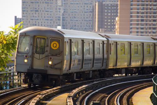
Wide shot of a speeding subway train inside a tunnel. Not much light in the tunnel except for what’s pouring out of the cars’ windows. Motion blur and glare make it impossible to see inside at the moment. (I’m liking it already. Why? Because he has a link to some reference for his artist. Good! I love reference. Know what I’d love even more? To know if the train is coming toward me or going away from me.)
CAPTION (BROTHER NICK): MY NAME IS BROTHER NICK AND I’M GOING TO TELL YOU A STORY ABOUT MONSTERS. (Comma-fail.)
PASSENGER 1 (OP/BURST): OH MY GOD!
PASSENGER 2 (OP/BURST): GET BACK! GET BACK!
CAPTION (BROTHER NICK): ABOUT PEOPLE BEING MONSTERS. (See what he did here? He underlined the word he wanted to be emphasized. Not enough of you do that. Remember, italics can get lost when it comes time to letter the page, but underlining will NEVER get lost. But I want you to notice what else Yannick did here. He has Cap, Pass, Pass, Cap. Some of you would think less dramatically, and would group the captions together. That would be a mistake. You break it up in the order you want it read, leading the reader’s eye. The only thing I’m thinking is unnecessary is the naming of the caption. Unless someone else has a caption, or unless an omniscient Narrator pops up, I’m thinking that it’s just a little bit more work than needed. However, extra is never bad unless it’s distracting. This isn’t distracting.)
Panel 2
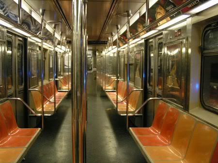
We’re now inside one of the subway cars. Make this a tall panel because we’ll have to show a good length of the car’s interior. The camera is located near the front of the car, looking towards the rear, so the top of the panel shows the back of the car while we’re moving up front as we go down the panel. At the top, we can see BROTHER NICK with his left hand in the pocket of his parka, holding on to a pole with his left hand. His hood is up so we can only see the bottom of his face – totally neutral expression. The rest of the panel is filled up with passengers (typical morning rush hour commuters – have fun!). As we move down to the bottom of the panel, the expressions on their faces go from curious and annoyed to repulsed and panicked. In the foreground, a SICK MAN is writhing in pain, crouched in front of the crowd, but we can only see him in silhouette. (In order to get this angle, we’re going to have to be high up, looking down. I’m not totally convinced this is the way you want to go. You can only go up so high in a train, and unless it isn’t crowded, you’re not going to be able to see the entire length of it, especially not someone on the deck. In short, this panel cannot be drawn. Second, if his left hand is in the pocket of his parka, how can his left hand also be holding onto the pole? Simple goof, I know, but you have to call these things out.)
CAPTION (BROTHER NICK): AND I DON’T MEAN THAT IN THE METAPHORICAL SENSE.
PASSENGER 3 (OP/BURST): LEMME THROUGH!
PASSENGER 4 (OP/BURST): HEY! QUIT YER SHOVIN’ UP FRONT!
SICK MAN: AAAAARGH
Page 1 (continued)
Panel 3
Medium shot of BROTHER NICK still standing calmly at the rear of the car, same position as in the last panel. You can see the emergency door behind him and some of the passengers closest to him in front. They’re not paying attention to him; everybody’s craning their neck to have a look at what’s going on at the front of the car.
CAPTION (BROTHER NICK): NO, THIS IS ABOUT WHAT WE KEEP INSIDE US, WHETHER WE NURTURE IT OR LET IT FESTER.
PASSENGER 5 (OP/BURST): THE HELL IS WRONG WITH THAT GUY?!
PASSENGER 6 (OP/BURST): DON’T LOOK, SWEETIE! DON’T LOOK!
Panel 4
Close-up of BROTHER NICK’s left hand reaching inside his jacket, right side. (Just to be sure, he’s no longer holding onto the pole? Because he was doing that with his left hand.)
SICK MAN (OP): RRRRRGH
CAPTION (BROTHER NICK): BUT MOST OF ALL
Page 2 (Splash)
Inverted shot from panel 2 on page 1: the camera is now behind BROTHER NICK’s shoulder, looking towards the front of the car. He’s pointing a pistol towards the front of the car, aiming through the crowd at the SICK MAN who has just finished his transformation into a WEREWOLF. It has thrown its head back, arching its back and letting out a howl. All the commuters are reeling back in fear, their attention focused on the beast rather than on BROTHER NICK. (I don’t like it. There’s a reason for that, though. You have the werewolf too far away from Nick. It loses punch, because you still have to deal with the people and the confines of the car. If you halve the distance between them, this would be more effective. It would also put the spotlight more clearly on the werewolf, which is where you want it, anyway.)
CAPTION (BROTHER NICK): IT’S ABOUT WHAT IT LOOKS LIKE WHEN IT FINALLY COMES OUT.
WEREWOLF: AROOOOOOOOOOOOO!
TITLE: A SHOT IN THE DARK (Know what I like about this title? It’s the same title as the first Pink Panther movie.)
CREDITS
Page 3 (2 panels)
Panel 1
BROTHER NICK POV shot. The passengers are now in full panic mode with some of them having turned towards the rear of the car. For the most part, they do a good job of standing in the line of fire, almost completely obscuring the WEREWOLF in the back. Their expressions are a mix of fear and surprise. In the foreground, at the bottom, we can see BROTHER NICK’s left hand holding the gun, still aiming through the crowd. (So this places the camera behind Nick. Got it. Although I don’t know what kind of hero he is, blocking the exit like that.)
CAPTION (BROTHER NICK): SOMETIMES IT CAN TAKE YEARS. SOMETIMES IT’S JUST A MATTER OF DAYS. I TRY TO BE THERE WHEN IT HAPPENS. (I think the last sentence would work better if it stood out on its own. It sounds more ominous that way.)
Panel 2
Here’s a tricky one: on the left, it’s a close-up of BROTHER NICK’s closed right eye and, as we move towards the right of the panel, there’s a shift in coloring and style that denotes a flashback. The right side shows a close-up of NICULAIU’s closed left eye. So the whole panel is in fact a merging of two half faces into one, moving from the present to the past. (So this is a close-up, split panel of a face. Not tricky.)
CAPTION (BROTHER NICK): BECAUSE ONCE IT’S STARTED, IT CAN GO REALLY FAST.
BULLY (OP): <TIME’S RUNNING OUT, LOSER!> (Okay, Rich, you’re up. Tell me everything you understand about this line, what you don’t understand, and where you think it should be placed.)
Page 4 (5 panels)
Panel 1
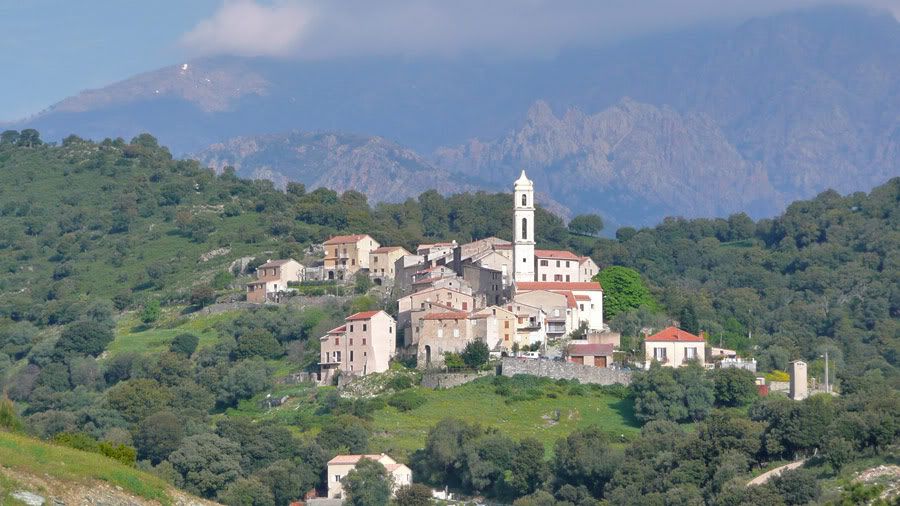
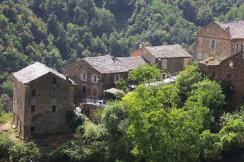
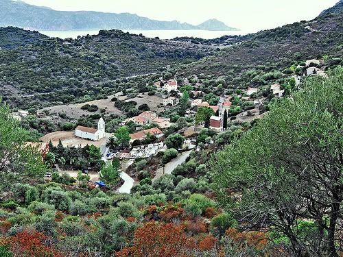
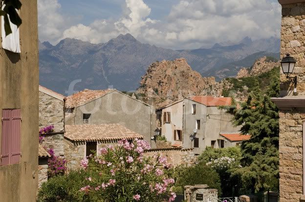
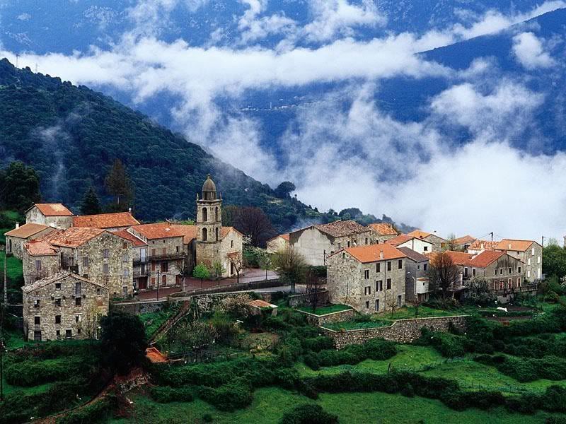
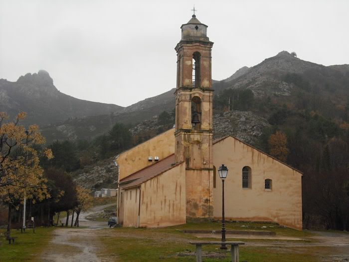
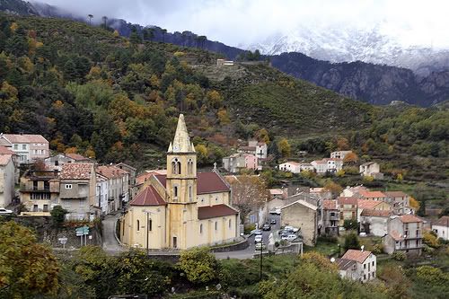
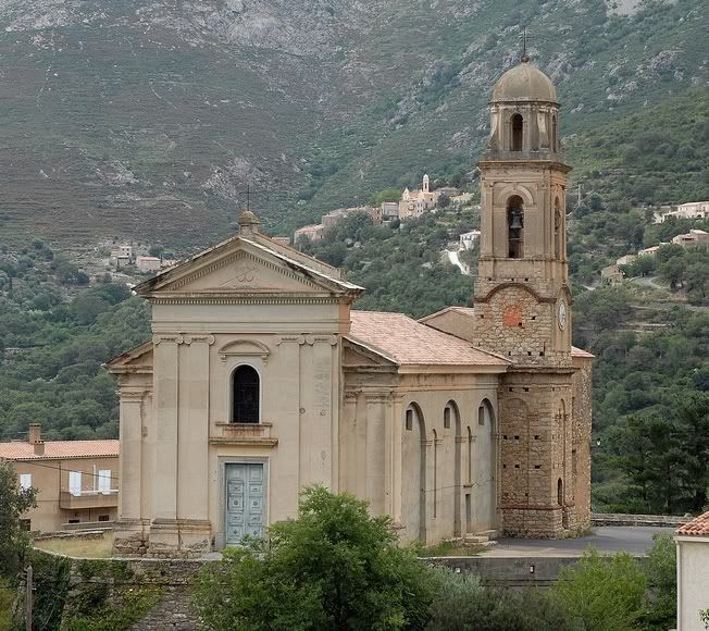
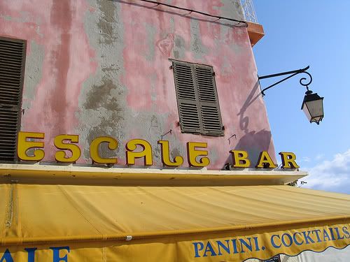
Elevated view of a Corsican village’s square (here are a few reference pics: HERE, HERE, HERE, HERE and HERE). It’s a sunny afternoon. Apart from a few houses, we can see an old church (maybe a mash-up of THIS, THIS and THIS) and a little café (PIC! PIC!) where the owner is pouring wine for two old patrons out front. There’s a fountain in the middle of the square. In the middle of the square, there’s a fountain before which stands a BULLY and NICULAIU. The BULLY, a tall nasty-looking kid, older than NICULAIU, is dangling a stack of four of five books over the water, holding them by the leather strap that bounds them (He’s French Canadian. English is his second language. A great deal of us have trouble with our first. That means I’m definitely not going to ding him for the wrong form of the word bind because I knew what he was getting at.). NICULAIU is standing a few feet in front of him, eyes closed, head lowered and fists clenched at his sides in silent resignation. (You’re asking for a bit much here, though, Yannick. How high up are we talking? Too high, and you lose some emotional acting on their faces, but you get the square. Not high enough, and you lose the square. I’d rather you lose the square than lose the emotional content.)
CAPTION: CORSICA, 15 YEARS AGO (See this? This is the reason why he’s naming the other captions. Good! Necessary? I don’t think so. Not unless there’s a lot of both. A small note to the letterer for this would suffice. And notice, too, the lack of ending punctuation. This is not an error, because this is just giving a time and place. If he does it again and puts in ending punctuation, then one of them would be a mistake.)
BULLY: <THINK YOUR BOOKS CAN SWIM, NICU?>* (See this? This is getting the name in as early as possible. I like the attempt. Why do I call it an attempt? Because in the previous panel, he was called a loser. It seems unnatural to me to start with name-calling, and then use the person’s name. Some time has to expire first, and you don’t have enough in Panel Time or Border Time for that to occur.)
CAPTION (SMALL): *TRANSLATED FROM CORFU (See this? If he had an editor, this would be an Editor’s Note. But what’s more important, I REALLY like the placement. No, he didn’t put the note on the previous page, where the translation first started. That would have interfered with the emotional content of the panel. Instead, he puts it where it would be used best, on the first panel of the next page. VERY good instincts, Yannick!)
Panel 2
Over-the-shoulder shot behind the BULLY. He’s back to us but his head his turned towards us with a surprised look on his face. NICULAIU is still standing in front of him with his eyes closed, but a tear is streaking down his left cheek. A large shadow is falling upon the BULLY. (A bit convoluted, but I got the point. Because this is from left to right, the elements should be grouped so. The shadow seems to be tacked on when seen in that light, doesn’t it? It should be near the beginning of this panel description.)
RINATU (OP): <WHAT ABOUT YOU?>
Panel 3
Medium shot of the BULLY with RINATU standing behind him., not looking happy at all with his fists on his hips, The BULLY is now facing RINATU who is easily a couple of heads taller. Don’t be afraid to use perspective to make him appear gigantic, blotting out the sun with his large frame.
RINATU: <CAN YOU SWIM?>
Page 4 (continued)
Panel 4
Side shot of RINATU leaning forward, his face close to the BULLY’s, eyes narrowed threateningly.
RINATU: <BEAT IT.>
Panel 5
Medium shot of RINATU handing NICULAIU back his books. Both are smiling as the younger boy is wiping away his tears. In the background, we can see the BULLY running away. (Good! Some would have forgotten to place the bully in the panel, thinking their job was done when he was told to beat it.)
NICULAIU: <THANKS, RINATU.>
RINATU: <ALWAYS A PLEASURE TO SCARE SOME SENSE INTO THAT GOAT TURD.>
RINATU: <COME ON, I’LL WALK YOU TO THE CREEK. YOU’LL BE SAFE THERE IF HE DECIDES TO BRING BACK SOME FRIENDS.>
Page 5 (6 panels)
Panel 1
Wide shot of the Corsican countryside (here are a few examples HERE, HERE, HERE, HERE and HERE). The boys are walking towards the right on a gently upward sloping path through a rocky plain with a few sparse trees. RINATU is in the lead while NICULAIU is struggling to catch up some 30 feet behind. It’s a beautiful summer afternoon and the sun is bringing out all the bright colors of the Corsican landscape.
NICULAIU: <WAIT UP! I CAN’T WALK THAT FAST!>
RINATU: <IF YOU WORKED YOUR LEGS AS MUCH AS YOUR EYES, YOU’D ALREADY BE IN SARDINIA!>
RINATU: <LESS READING, MORE SPEEDING!> (I don’t get the second half of this line. Remember, I’m not smart.)
Panel 2
Medium shot of NICULAIU with his back to us. He’s facing an ascending rocky slope. In the background, RINATU, also back to us, has just reached the top of the ridge.
NICULAIU: <I LIKE READING. IT’S QUIET AND IT’S SAFE.>
RINATU: <YEAH, YOU LOOKED REAL SAFE BACK –>
Panel 3
Inverted shot of the previous panel. RINATU is now facing us. He’s stopped in his tracks, staring blankly at something in front of him off panel. NICULAIU is just catching up with him, visibly exhausted.
NICULAIU: <FINALLY! I DON’T THINK I COULD’VE WALKED FARTHER.>
Page 5 (continued)
Panel 4
Same shot. NICULAIU is now standing right next to RINATU, looking towards us too. RINATU still has a blank surprised look on his face.
RINATU: <NICULAIU, DON’T LOOK.>
NICULAIU: <DON’T LOOK AT WH — ?>
Panel 5
Same shot. RINATU is still looking towards us with the same dumbfounded look but NICULAIU has turned back, his hand to his nose and mouth.
NO COPY
Panel 6
Wider shot. In the foreground, we see the half-eaten remains of a girl about NICULAIU’s age: a hand hanging limply from a ruined arm, some protruding ribs and other bones, a few feasting crows and flies. Let’s keep it mostly in silhouette; we won’t be pitching this to Avatar Press! Behind the corpse, the two boys. NICULAIU has already started down the slope, retching. RINATU is gently nudging him away.
RINATU: <COME ON, WE HAVE WE HAVE TO WARN THE VILLAGE.>
I think that’s a pretty good stopping point. Always leave ’em wanting more, right?
Let’s run it down.
Format: Flawless victory. Not only that, but Yannick took the extra step that most of you forget when submitting to TPG: he has his contact info as a header on every page. Good on you, Yannick!
Panel Descriptions: For what is basically his first time out, this isn’t bad at all. Some things that can’t be drawn, or that aren’t thought all the way through, but not bad at all. I can definitely see in this that Yannick is used to writing visually. He just has to get more used to writing for comics. That will come in time. This is definitely a good start.
Pacing: I’m not all that excited about going into a flashback almost immediately. The first scene isn’t even done, and into Flashback-land we go. However, he was able to keep reader interest. Show the werewolf, talk about harboring monsters, and then go into the past and show a dead body within two pages. The pacing is fine. No problems with it. I just wish the first scene were closer to being finished before dipping into the past.
Oh, remember that dialogue is part of pacing, as well. Just that one line which I think would work better by itself, but other than that, the dialogue was also paced well.
Dialogue: Generally, very natural. Again, I could see that Yannick is used to writing. There was only the small gaffe in getting Nicu’s name in there. It felt forced. Maybe if his name were used first, and then the name-calling. That might work better. But the dialogue is extremely readable.
Content: Ah, werewolves. They don’t get the amount of love that vampires get, but they also aren’t all that sexy. Not much to identify with, because humans don’t really like seeing themselves as monsters.
As a reader, I’m intrigued by the first five pages. If the art were spectacular, I’d even give it a read. Werewolves are very difficult to do right, because it is exceedingly easy to do wrong. But my interest has been piqued, which is always a good thing to do for a reader.
Editorially, I’d either start with the flashback, because it seems interesting enough to start the story (and personally, I feel that not enough stories start in the past while keeping things interesting), or I’d consolidate the beginning a bit more before moving into the flashback. I wouldn’t split the difference, as Yannick does here.
And that’s almost it.
As I said before, I’m running low on scripts. ComixTribe will be launching a new column called Thumbprints with Jonathan Rector, the artist of the award-nominated comic, The Standard. He’ll be taking scripts from The Proving Grounds and thumbnailing a page or two from them. In order to have your shot, though, you have to submit a script.
It should be good.
And that’s it! Check the calendar to see who’s up next.
Related Posts:
Category: The Proving Grounds


BULLY (OP): (Okay, Rich, you’re up. Tell me everything you understand about this line, what you don’t understand, and where you think it should be placed.)
I understand its in another language, but I don’t know which (yet). I don’t understand who’s speaking or being spoken to (yet). I don’t understand if its being spoken in the present or the flashback, which is the only issue that’s really a problem. So, I think it should be clearly noted that this line should be on the flashback side of the panel.
I also think it should be placed above Brother Nick’s caption instead of below – for two reasons – 1, it breaks up Nick’s dialogue a bit, and adds a beat for his words to sink in a little, and 2, the caption is a much stronger line to end the page, and the scene on.
You’re absolutely right, Rich. In my head, I saw the caption on the flashback side of the panel. Unfortunately, the artist won’t have access to that particular piece of documentation so I better specify it in the script!
As for placing the bully’s caption above Brother Nick’s, you’re right again. Both captions support each other really better when placed in the order you propose. Consider it part of the next version of the script!
Thank you for this imput! It’s certainly going to be put to good use! 🙂
I don’t watch baseball. I find it particularly boring. But if I did, I’d have to call this a ground double. And I picked on Rich for exactly this reason.
He saw, but he missed it, so he saw without seeing.
Rich was correct in everything that he said. What did he miss?
He understood everything that he was supposed to, and didn’t understand everything he was supposed to, except one.
I don’t understand the need for the quotation marks. If the dialogue is off panel, then there’s no need for them. If it were a caption, then it would be fine. But it wasn’t.
Other than that, Rich’s response was perfect. If he had gotten it, it would have been a home run.
Why did I pick on Rich specifically about this? Because he missed the same thing on another script a few weeks ago.
Just goes to show you, it’s the simple things that’ll bite ya.
Thanks, Rich!
Ah! I see it now! So this line should have been:
CAPTION (BULLY):
or rather – as we’ve previously established:
CAPTION (BULLY):
Almost, but not quite.
Here’s why:
You have the split panel. Each side has it’s own slice of Time, right? So, you were correct wih the bully being off panel, and were correct with the word balloon. You were incorrect with the quotation marks. They’re not needed because you have a person speaking in panel, in that Time, but who just couldn’t be seen.
Do you see it now?
Oh yessss! It’s so obvious now! Why didn’t I see this before? So the line becomes:
BULLY (OP): [TIME’S RUNNING OUT, NICU!]
Oops, it seems the comment interface eats up anything put between pointy bracket thingies, probably because it considers them HTML tags or something.
What I meant was:
CAPTION (BULLY): [TIME’S RUNNING OUT, NICU!]
but replace the straight brackets by the pointy ones.
Curses! Foiled by quotation marks! AGAIN!!!!!!!
Maybe, but I bet you have a great idea for a new supervillain now.
Steven, thank you so much for all of these editing comments. This is priceless advice that will not only help me make this a better story but that I will also be able to apply on my next scripts. I only wish I had seen this before submitting my second script to the proving Grounds! Oh well, you always learn and I’ll show it from my third script onward.
I also want to thank you deeply for the confidence this exercise has provided me. I think I needed this to get a proper measure of what I was capable of, both good and bad. Now I have a better idea of where I stand, what I need to work on and what sacrifices I can afford to make to go forward.
Now if you thought I’d have less to say this week 😛
Page 1 – Panel 1 – I got misguided by the lure of the reference picture. I saw the direction the train was going in the pic and neglected to specify it in the script. As for the comma-fail, I tend to confuse French and English punctuation rules. I really need to sit down soon and study them so I stop making these easy mistakes. MY NAME IS BROTHER NICK, AND I’M GOING TO TELL YOU A STORY ABOUT MONSTERS. There.
Page 1 – Panel 2 – My first idea was a traveling shot going from the front of the car to the back, but you obviously can’t do that in a comic. So I tried angling the shot from higher up in the hope that the artist could scrunch up the perspective. I now understand now that I’m only causing him some headache this way. Furthermore, I realize that I only put so much distance between Brother Nick and the Werewolf so I could set up the miracle shot at the end of the comic. I think what I’ll do now is murder this darling and find another clever thing to do instead. I’ll place Brother Nick halfway down the car and change the challenge he faces with his trick shot later on. As for the two left hands, that’s an unforgivable gaffe. I should have made someone else read the script too; I was too close to the details to see obvious mistakes like this.
Page 1 – Panel 4 – Gah! Gotta check all those hand placements! I changed it back and forth a few times as I was rewriting the climax. I probably dropped it on the last pass.
Page 2 – Yup, closing the distance is the ticket. Maybe I’ll have one of the passengers activate the emergency break. The sudden jerk should provide challenge enough to compensate for all those people I’m taking lout of harm’s way. 😛 Like you say, it will also present the benefit of taking full advantage of having a FRIKKIN’ WEREWOLF on the page instead of hiding him in the back like I just did.
The title – Would you believe I had never thought of the Pink Panther movie before you mentioned it? In fact, this title is one of the first things that came to me as I was plotting out the climax of this story (the werewolf popping up in a crowded subway car scene was the whole starting point though).
Page 3 – Panel 1 – Brother Nick is clearly more of the hunter mindset than the hero one. 😛 Moving him up front a bit will let some of these poor people use the exit door. And good call on splitting the caption in two. I see what you mean about the added dramatic weight. Anyway, this should be a fairly large panel – being the first of only two – so we can afford the space for two captions.
Page 3 – Panel 2 – Well it was tricky on the first try. It got better by the time I got to the 12th or 13th rewrite of this description. Thinking of describing it as a split panel would have made it way easier. I’m writing this term down so I can remember to use it later.
Page 4 – Panel 1 – I was trying to do an establishing shot at the same time I was continuing the scene that had technically started at the end of the preceding page. That’s why I slipped up and asked for impossible things: a wide shot of a whole village square containing details that could only be seen in a tight shot. The way I see it, it could either be fixed by tightening the shot around the action (it’s the option you prefer), relying on background décor to establish the scene, or by staying in an elevated view, thus taking out some of the details on the characters, hoping that their present relation is made clear enough in the second panel. And yeah, I’ll probably take the loser out of the last page and put in the character’s name instead.
Page 4 – Panel 2 – Oh yeah, definitely. Gotta move that shadow bit at the beginning.
Page 5 – Panel 1 – As I read this last line again, I can’t help but not liking it. It’s an out-of-place lame pun considering the cultural context. I’ll take it out.
Pacing – You know I was certain I’d catch some flak about the Lupus Interruptus. 😛 I did it on purpose because I wanted my two narrative tracks to come to the same point before going forward together. The present track reaches this point on page 3 while the flashback basically takes most of the comic to catch up. This is my structure:
1. PRESENT: Brother Nick, the warrior monk, is faced with a werewolf he has to fight in exceptionally adverse conditions.
2. FLASHBACK: Niculaiu, the quiet child, has his village depleted of children by an unknown monster. He finally decides to hunt the beast down. As we near the climax, he is faced with a [SPOILER] he has to fight in exceptionally adverse conditions.
* * * Both tracks are now at the same point. * * *
3. FLASHBACK: Niculaiu does something miraculous.
4. PRESENT: Brother Nick dos something miraculous.
5. PRESENT: The werewolf is defeated.
6. FLASHBACK: The [SPOILER] is defeated.
7. FLASHBACK: Situation resolved.
8. PRESENT: Situation resolved.
Content: If you like werewolves, you’ll love the [SPOILER] I put in near the end!
Editorial – I see what you mean by starting with the flashback. It’s true that I establish a mystery right from the start of this sequence and that could be strong enough to carry reader interest through the first pages. However, I was afraid I’d introduce Brother Nick too late and it’d come off as rushed or incoherent. I’ll also admit that I’m in love with the bookended structure I’ve used, but I’d be prepared to murder that darling too if it meant it made the story better. After all, readers will be pulled in by an engaging story, not clever literary tricks.
I knew what you were doing when you has the Lupus Interruptus. You said you were dong something like this when I went over a previous script. I just didn’t like how soon you went for it. Three pages is too soon, especially for a first issue. Give the reader some time in the first setting before whisking them off to another.
As long as you have an editor, don’t worry so much about the punctuation. English is EXTREMELY difficult to learn. A minor mistake here or there won’t kill you, unless you’re submitting cold. But once you have the editor and they understand you’re bilingual, a minor punctuation flaw here and there is to be expected. Hell, I correct John Lees’ punctuation at least three times per script, and he speaks the Queen’s English. (Writes it, too!)
As for the editorial, this is definitely something that can be worked on. The story would just have to be worked on a bit in order to work within the structure. Lengthen the train fight by two pages, and shorten the flashback by two, and you’re golden. Or, if necessary, just lengthen the book by two pages. There is no golden rule that says a book has to be 22 pages in length. A lot of Marvel/DC comics are 20 pages in a cost cutting effort in order to lower prices. Let the story dictate the page count, not the other way around.
You know, “Lupus Interruptus” would be a great title for a story about a man who keeps getting cut off in the middle of changing into a wolf. Anyway…
I see what you’re getting at. Indeed, three pages is a little curt to allow the reader to get comfortable with the settting, let alone adopt Brother Nick as the main protagonist instead of just a voice in the flashback captions.
Adding a couple of pages after the man’s transformation could help a lot into establishing him as a more sympathetic character from the start. For example, he might in fact get to save some people who are within the creature’s reach and maybe dodge a few swipes before going in for the kill. Let’s make him earn that miraculous shot. 😉
As for taking some pages out of the flashback, I have a good idea where to do it: there are two pages that are practically nothing more than travel time between Nicu leaving his home and him encountering the [SPOILER].
The only thing that worries me though is that it might jumble my page-turns. I have a habit of structuring the flow of the story around cliffhangers and reveals. Playing around with the page count for the scenes will prove a nice challenge. Well, we’ll see once I’ve tried it. As for the final number of pages, you’re right that it shouldn’t take precedence over the story.
Thanks again for the stellar advice!
As you can guess, I agree with much of what Steven has said. Especially about the first three pages. I will be honest that the flash back doesn’t make me care much about the character at all because I haven’t really made a connection with him yet. I am not even sure he is a good guy at the point before the flashback. Having that scene finish I think would make the flashback more powerful. The problem with werewolf books is they have been changed so much in recent years. Heck in half the werewolf stories now being written they are the heroes. Let us know just what kind of story you are planning to tell before you give us the back story. Otherwise, it was a good read and great example for formatting and using references.
Thanks for helping us all out Yannick.
Noel, you bring up a great point that hadn’t really occured to me before today: I’ve been living so long with the idea of the protagonist in my head that I’ve neglected to properly introduce him to the reader. You’re right and, like I told Steven just above, with two extra pages in which I can show him doing more than posing, I’ll have room enough to make him sympathetic. Heck, at least heroic!
In short: Brother Nick is some sort of warrior monk in the tradition of the knights errant of old. The werewolf is a true villain: this man becomes a monster not because he’s victim of a curse, but because he’s a violent predatory individual. His true inner nature manifests as a legendary beast the same way that Brother Nick’s selflessness and courage manifest as paladin-like abilities. In this world, you truly become what you are deep inside.
Now I just have to be as clear in the comic as I just was here!
(Gee, that would be all great in the pitch though.)
Thank you for your comment, Noel, you really brought some things into perspective that were at the heart of this story, things I couldn’t see for lack of distance. I think I’ve been carrying this story for too long. Can you believe is started out as a video game design document? 😉
It feels great to have the Tribespeople come out to sit around the fire with me. I’m glad to have had my turn telling the story this time. 🙂
Really interesting script, Yannick. I could totally envision that opening sequence, with the werewolf in the close quarters of the subway carriage. Nice opening set-piece to instantly grab people’s attention. Good work!
Also, it may have been overlooked amidst the other editing comments, but am I the only person to notice that JONATHAN RECTOR IS WRITING A FREAKIN’ COLUMN FOR COMIXTRIBE!?!?!?! AWESOME! Why am I only hearing about this now!?
I know! Isn’t it great? I can’t wait to see the first installment. Jon is an incredibly talented guy. Not to mention that it’s going to be very enlightening to see how a professional artist tackles our script.
Thank you, John. I’get had this opening scene in my head for a very long time. I think I was inspired at the time by a scene in a movie: a department store Santa suddenly turns into some kind of crazed zombie with all these people around. “Rage” I think the movie was called. The idea of someone suddenly becoming a monster in similar circumstances prevented me from sleeping for a few days!
Now, thanks to Steven’s and Noel’s input, I’ll be able to make this scene even better.
The great thing about having a monster on a subway car, is any potential victims are STUCK. It creates that sense of seclusion that all great horror stories need, and cutting from that to a Highlander type flash back is a great hook.
My thoughts exactly, Conner. A subway carriage (or, for that matter, a plane) are great locations to stick a monster, because people can’t just run away.
“I’m sick of these m#########ing werewolves on the m#########ing subway!”
Come to think of it, that doesn’t really fit with my protagonist’s personality. 😛
The fact that you have victims that can’t run away is a great twist when you mix horror with superheroics: the challenge for your hero is greatly heightened. What’s your priority in this case: slay the beast or protect bystanders?
And lo! there be a Highlander reference from Conner of clan MacDonald! 😛 But seriously, I hadn’t seen the parallel – good catch!
I was named after Connor McCloud of Highlander actually. The only diffrence being my parents raised me spelling it ER instead of OR… though legally I am OR… Really dont know why that did that…