
Review: Rapid City #1
Around a year ago, I reviewed Rapid City #11, and now writer Josh Dahl and artist Anad Kaviraj are back with their follow-up, Rapid City #1: long story, go see the previous review for further explanation. Now, in my review for issue #11, I talked about how this creative team showed promise with what was an admitted early, experimental effort for both of them, but there were some teething troubles, and flaws that hampered my enjoyment of the comic. One point I brought up is that Rapid City #11 didn’t really work as an issue #1″, in that not much was done to introduce this world or give it a niche to drive us forward. Unfortunately, and less forgivably, Rapid City #1 doesn’t work well as an issue #1 in this regard either.
I should start by mentioning how Josh Dahl has improved in the intervening year. In my previous review, I noted how he sometimes had issues with clunky dialogue, making thematic points too on-the-nose or laboured. That weakness has pretty much evaporated now, and Dahl has developed a fine ear for more naturalistic speech. As a result, this issue gives us a collection of scenes that build into some well-realised character portraits, particularly of our lead hero, Kinetic. On a technical level, his scenes operate much better, with more efficient use of panel space than before. Various individual scenes, such as Kinetic’s confrontation with his frustrated girlfriend, are skillfully paced.
The problem comes with the bigger picture. As a collection of scenes, yes, there is good writing here, but I’m not sure if it quite fits into a compelling whole. Dahl has given us interesting characters, but still hasn’t provided them with something interesting to do. Yes, Rapid City is evidently more character-driven than plot-driven, and I’m all for that, but even in indie books (which Dahl markets Rapid City as splicing the superhero genre with), in all but the most static of introspective autobiographical texts, there is still something happening, some drama that drives the character forward and informs their development and self-discovery. And I think that’s what’s lacking in Rapid City. In ruminating on their identity, one character speaks of it as an empty vessel waiting to be filled , and in a lot of ways that’s what this comic feels like.
When looking at the pitching document for the series, it is billed as a superhero comic book about the frustration of having a dream you don’t know how to follow and a four part story about doing what it takes. Now, I’m not saying that a comic can’t be about these things, but I will say that this would be a hard sell to passing customers on a convention floor. It’s just too abstract, too internalised. What Rapid City needs is this internal strife cast into stark relief against an external challenge that brings these character struggles to the fore. And maybe that’s coming (one character’s downward spiral subtly hints at future menace), but it isn’t here yet, and if you don’t give readers something to hook onto with issue #1, they may not come back for the rest of your slow-boil saga where you gradually reveal your hand. As it currently stands, things wring a little hollow. Yes, Kinetic jumps around town in costume with mentor Monkey, but you get little sense of it being more than just jumping around, players performing on an empty stage. The idea of superheroes with nothing to fight, and the resultng stir-craziness and ennui that may spring from that, could have some rich narrative potential. But to do that would require adding further meat to the bones of the world, of the Rapid City that gives the book it’s title, maybe explaining how it is these superheroes came to exist in this city and why there isn’t super-crime around to match it. World-building, that’s what’s needed here.
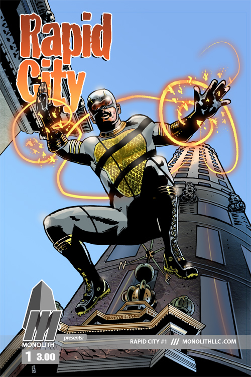
Anad Kaviraj’s art continues to be problematic, because while it’s still moody and atmospheric, there remains several of the same issues with clarity. And as we jump back and forth from scene to scene and different characters are introduced, the murkiness of the character designs combined with – at times – the lack of key pacing techniques such as establishing shots to signpost new scenes, cast a cloud of confusion over large portions of the issue, where I was momentarily unsure of who was who, if I was meeting someone new or returning to a previously established character, or whether we’d moved to a new location. I think the introduction of color would help immensely in making things clearer, as the stark black-and-white, without even the texture of grayscale, makes the book feel awful sparse. And with superheroes in particular, I think color is crucial.
I fear I’m being very negative in this assessment, which I feel bad about, as there’s much to like about Rapid City. Josh Dahl is a talented creator committed to refining his craft, and the learning curve between this and Rapid City #11 is clear. There is still a rich seam of potential in this world waiting to be mined, and much like Kinetic moves forward with fresh purpose here upon finding his name, perhaps Dahl’s storytelling will come alive once he has a clearer vision of the story he wants to tell.
***
 Writer: Josh Dahl
Artist: Anad Kaviraj
Letterer: Magnus
Cover Colorist: Micah Faulkner
Post-Production: Matt Bowers
Publisher: Monolith
Price: $3 print/$1 digital
Synopsis: Determined to begin a career as a superhero, Brian wonders just what’s in a name. And Maxwell Murder, having fallen on hard times, stalks the streets of Rapid City. You’ve got the powers. You’ve got the costume. You’ll have a name. What else do you need to be a superhero? Rapid City is the story of one man’s struggle to answer that question.
Rapid City #1 is available to buy in print from IndyPlanet or digitally from Graphicly.
Related Posts:
Category: Comics, The Creator-Owned Zone


