
Points of Impact – Week 9: Big In Japan
![]()
May 2012 – Week 3
Welcome all to another installment of Points of Impact, where – by a mystical process known as reading – we learn how to become better writers!
Once more:
- The BULLSEYE! section presents something that really wowed me. That’s usually when a writer does something unique among his peers.
- The HIT! section picks up on a cool trick that gets used pretty often – mostly because it works – but of which I’ve found a prime example.
- The MISS section however isn’t about praising a good shot but – as you guessed it – pointing out where a writer stumbled so you don’t put your feet in the same hole.
Now don’t you forget: this column is extremely spoilable! Go read your comics before you come back here!
BULLSEYE!
The manga-like sensibility in Nathan Edmondson’s DANCER #1
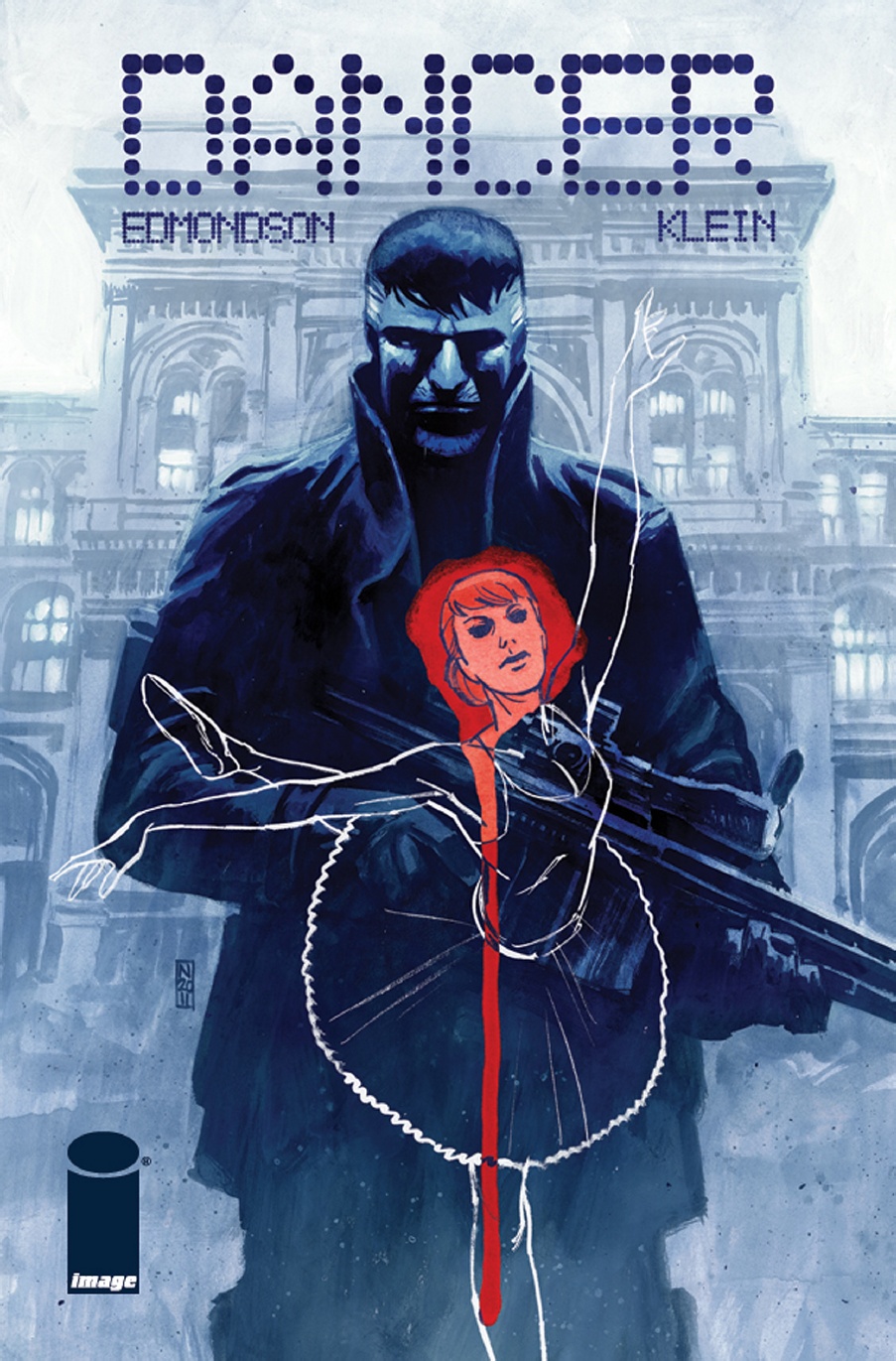 Story – script: Nathan Edmondson
Art – colors – design: Nic Klein
Letter: Jeff Powell
Yeah, yeah, I know. I’ve just evoked pictures of spiky hair, scarily enthusiastic schoolgirls and nonsensically large swords. Maybe I’ve even turned half of you off even picking this title off the shelf. Sorry, Mr. Edmondson!
However, the fact is manga is a treasure trove of special techniques and devices and we’d do well to study the way that medium tells a story. Having evolved mostly isolated from the North American and European practices, the “whimsical drawings” developed certain sensibilities that creators here at home are using more and more as they discover the invaluable effects they can create.
Nathan Edmondson’s DANCER #1 may be void of giant robots and inconspicuous ninja but it demonstrates a way of playing out a scene that is very reminiscent of what the Japanese creators do. Of course, I’m not affirming that this is what Edmondson set out to do with this comic, but it certainly fits the bill so that’s the interesting line of inquiry we’re going to follow right now.
DANCER #1 opens with a restaurant scene that is anything but exciting: people eating and drinking, soft Portuguese lyrics floating between the diners, wine, dance and some of these guys have really atrocious shirts.
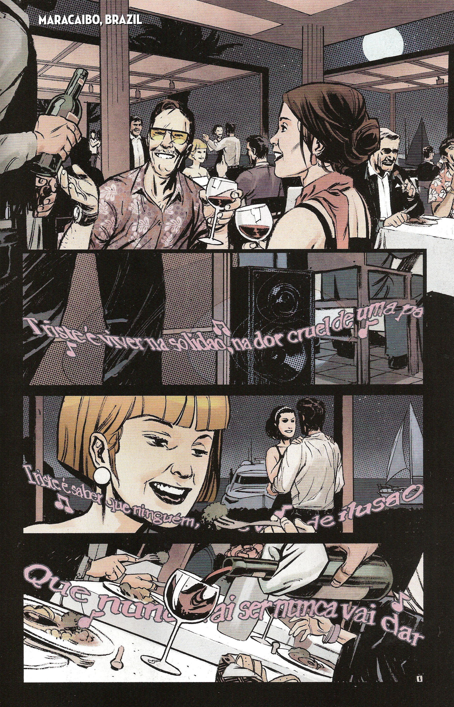
Those of you who’ve read my second Points of Impact on ComixTribe will find something familiar in this page: aspect-to-aspect transitions. Notice how the panels aren’t as much a sequence of consecutive events as much as a series of snapshots of roughly simultaneous actions. In fact, the only element that betrays these as not occuring at exactly the same moment is the music. It’s the only clue that time flows between these panels.
However, we still have the basic requirement for aspect-to-aspect transitions: multiple viewpoints of one scene that add up to a composite establishing shot. Indeed, the “traditional” way of starting this scene would have been to show us an exterior view of the restaurant with the “Macaraibo, Brazil” caption followed by a wide shot of the whole dining room. Instead, Edmondson decomposes the interior, selecting the elements that will allow him to give the reader a feeling of where the action takes place rather than the exact factual characteristic of that setting (such as the restaurant’s name). This insistence on atmosphere over factual qualifying – through the use of aspect-to-aspect transitions – is typical of manga.
That was the setup. Now let’s see what happens after the page-turn as Edmondson wisely uses the reveal to suddenly crank up the action.
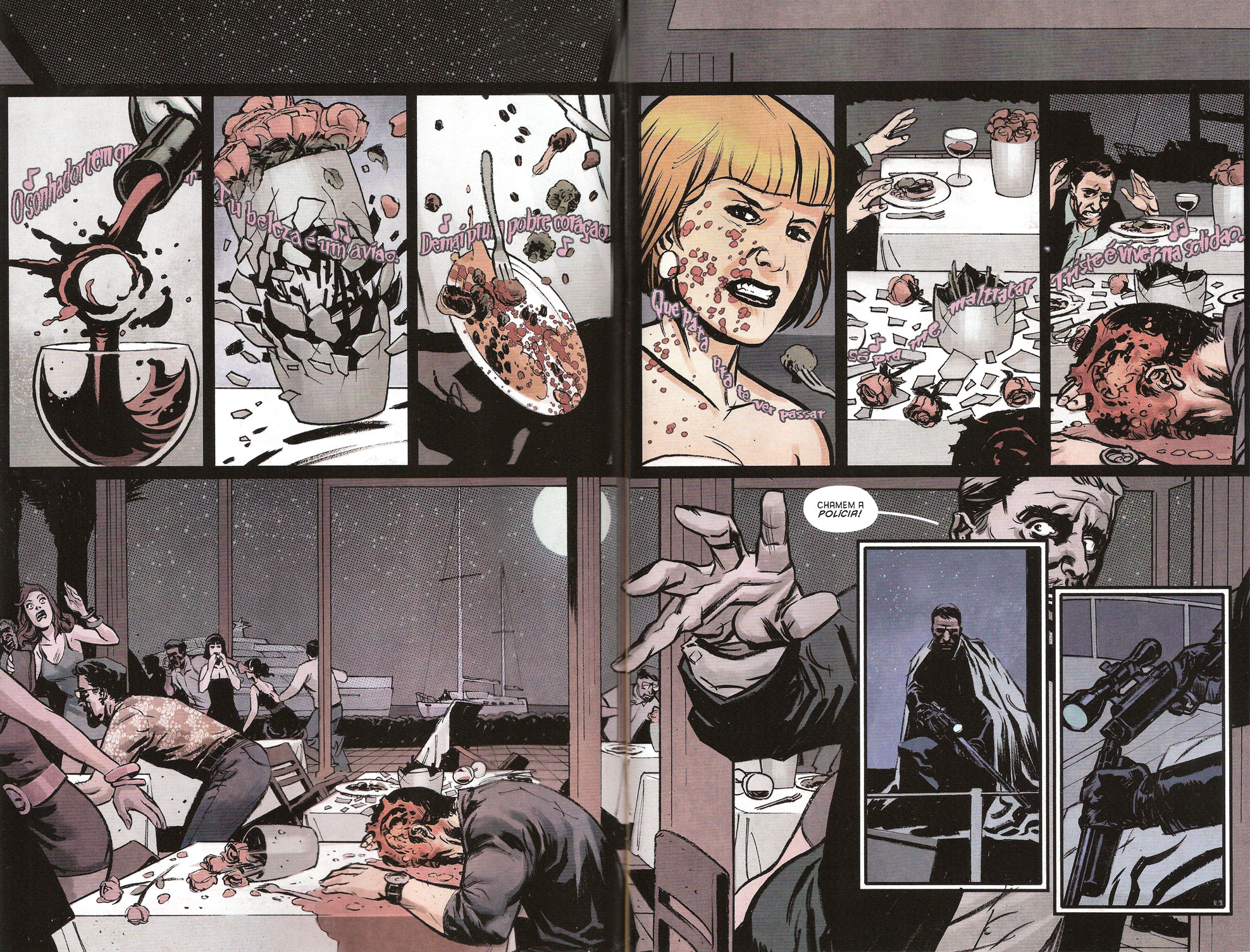
We have a double-page spread, the first tier of which is a rapid sequence of small panels leading up to one giant wide shot of the end results. Notice how we never see the shooter in the act of pulling the trigger, we never see the rifle be fired and we never see the bullet travelling to its target. All we’re shown are the various effects the bullet has on the elements presented in the previous page.
Once more, what we have here are aspect-to-aspect transitions. As soon as the shot is fired, Edmondson makes us revisit the scene in the same manner as he previsouly did, re-establishing the scene, this time with a bloodier bent. The final panel pulls back for a more traditional wide shot, not so much to show the panic that just broke out but to let the reader see the killer hiding in the background. This also has the effect of breaking up the aspect-to-aspect transitions and suddenly switching the time-flow to a more traditional one.
But even then, the next page has a few surprises for us…
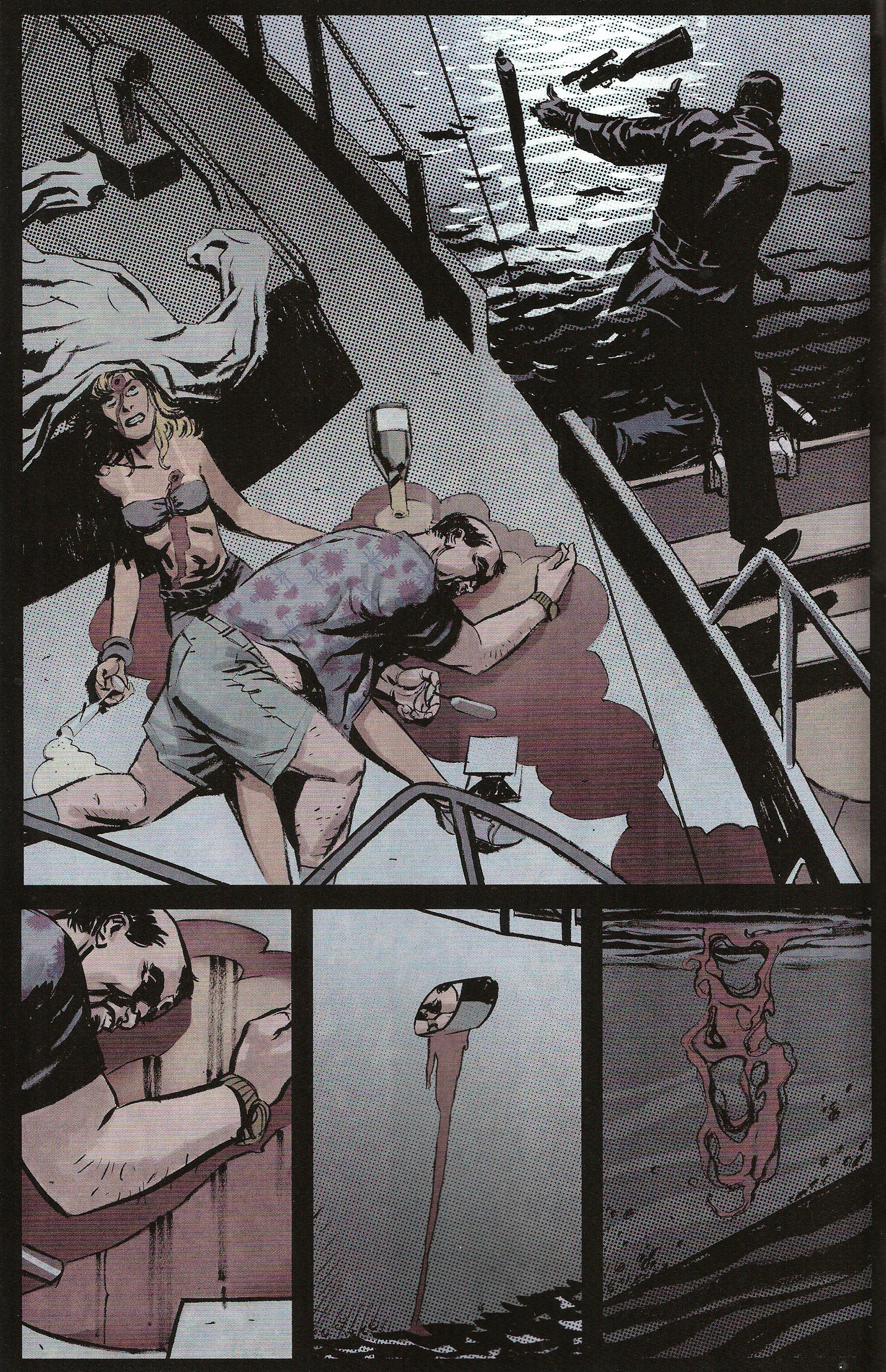
As you can see, we’re already back to aspect-to-aspect transitions, but the camera work is reversed. This time, we go from a wide shot to the multiple composite shots: the killer leaving the scene and then different views of the carnage he left behind. It’s as if Edmondson gave us a little relief with a normal transition – scene-to-scene – before returning to his manga-like building of the scene with aspect-to-aspect transitions.
In the whole, the use of this type of transition breaks away from the usual “get to the point” mentality associated with American comics. Indeed, a common accusation leveled at creators these days is to “write for the trade”, that is artificially upping the page-count of stories so it takes up more issues, thus ensuring the sale of a hefty and expensive hardcover collection. Readers feel like they get more for their money when the story moves at a brisk pace, often forgoing any story consideration beyond the bare-bones plot.
But a story is more than a sequence of events; it also involves characters with feelings and motivations that are more than accessory to the plot in question, and it also involves settings that contribute to establishing an atmosphere. Comics don’t have the luxury of movies of blasting your ears with a beautiful heart-wrenching soundtrack. Heck, as I’m writing this, I’m listening to Doctor Who’s series 5 soundtrack. I can tell you firsthand that the atmosphere it grants to this scene of me writing this article has a definite effect! Comics have to use other ways to set the mood – subtler yet sadly more convoluted ways – but ways that are proper to the medium.
The Japanese creators of manga have found out a long time ago that aspect-to-aspect transitions are one of the most effective ways to achieve this result. It will however require you to accept that plot takes a backseat for a short instant and to invest a few of your precious panels into giving the reader something to feel instead of something to see. All it takes is the courage to stretch your reader’s patience, break out of the traditional methods and throw yourself out of the comfortable nest of American comics.
And in DANCER #1, Nathan Edmondson spreads his panels and flies.
But more about ambiance later on…
Lesson Learned
When planning out an issue, consider using aspect-to-aspect transitions. Although they have the effect of slightly slowing down the plot, they present the non-negligible advantage of setting up ambiance in your comic. To do so, instead of lining up panels showing events in a chronological sequence, decompose your scene into different snapshots, each of them contributing to the overall mood you want to set. Not only will you be using an original method for establishing your scene, you will also inject a lot more ambiance into it than you would by using more traditional means. It takes more panels than usual to get there, but the gain in atmosphere is largely worth it!
HIT!
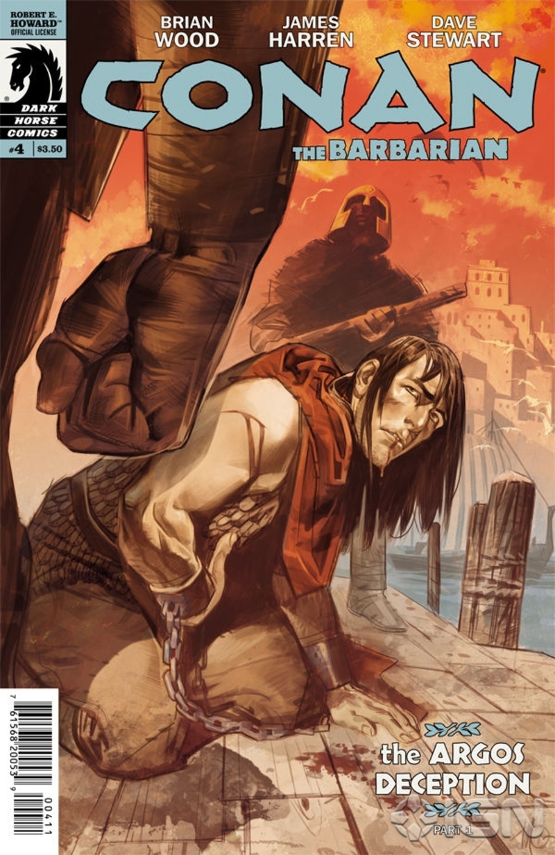
Location as character in Brian Wood’s CONAN THE BARBARIAN #4
 Script: Brian Wood
Art: James Harren
Colors: Dave Stewart
Letters: Richard Starkings
Cover art: Massimo Carnavale
Editor: Dave Marshall
I find that too often location in comics is treated as a simple backdrop to the action. The characters appear as actors in a minimalist mise en scene , forced to supply whatever ambiance they can with their actions and exchanges alone since there’s nothing but a plain curtain behind them. In the best cases, we’ll get detailed backgrounds in almost every panel – at least firmly establishing where the action takes place – while in the worst cases, we have to make do with speed lines and flat color fills.
However, if you want a location that almost steals the spotlight, I invite you to take a look at Brian Wood’s CONAN THE BARBARIAN #4. As a new storyline begins, Conan and the pirate queen Belît return to the port city of Messantia with an insidious scheme to rob the city blind! The plan is simple: deliver the wanted Conan in chains and steal everything not bolted down while the Barbarian goes through the process of being condemned to death. Of course, that’s the plan as it should go through. You know how these things go
Of greater interest here however is how Wood treats the city itself. There’s an inordinate amount of real estate devoted to showing its places and its people. For example, as soon as their ship pulls in, we’re treated to a superb double-spread of a view from the sea.
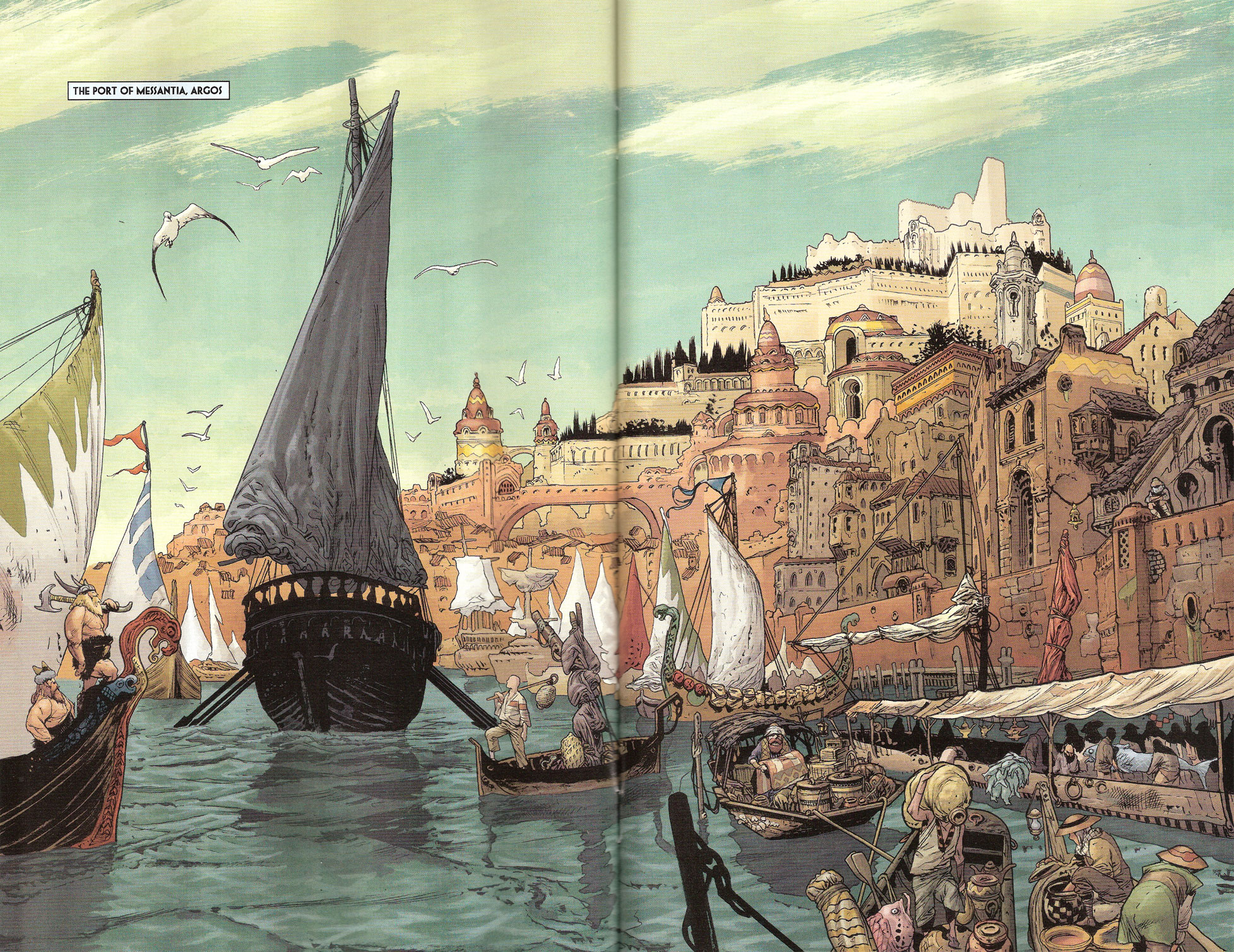
Now keep in mind that a double-spread is a huge investment in space in a 22-page comic. You’re basically spending the equivalent of 10-15 panels to show something that could be done in one tier-wide establishing shot. Why such an investment? The most obvious answer is that it makes for a pretty picture, but it also has another very pragmatic reason: it establishes the city of Messantia as an essential story element in equal footing with the rest of the cast. Wood doesn’t just want you to know where his story is taking place and what it looks like. No, this double-spread is a first step in making you know how Messantia feels like.
Witness how he drives the point home when a few pages later he takes us on a one-page tour of the city:
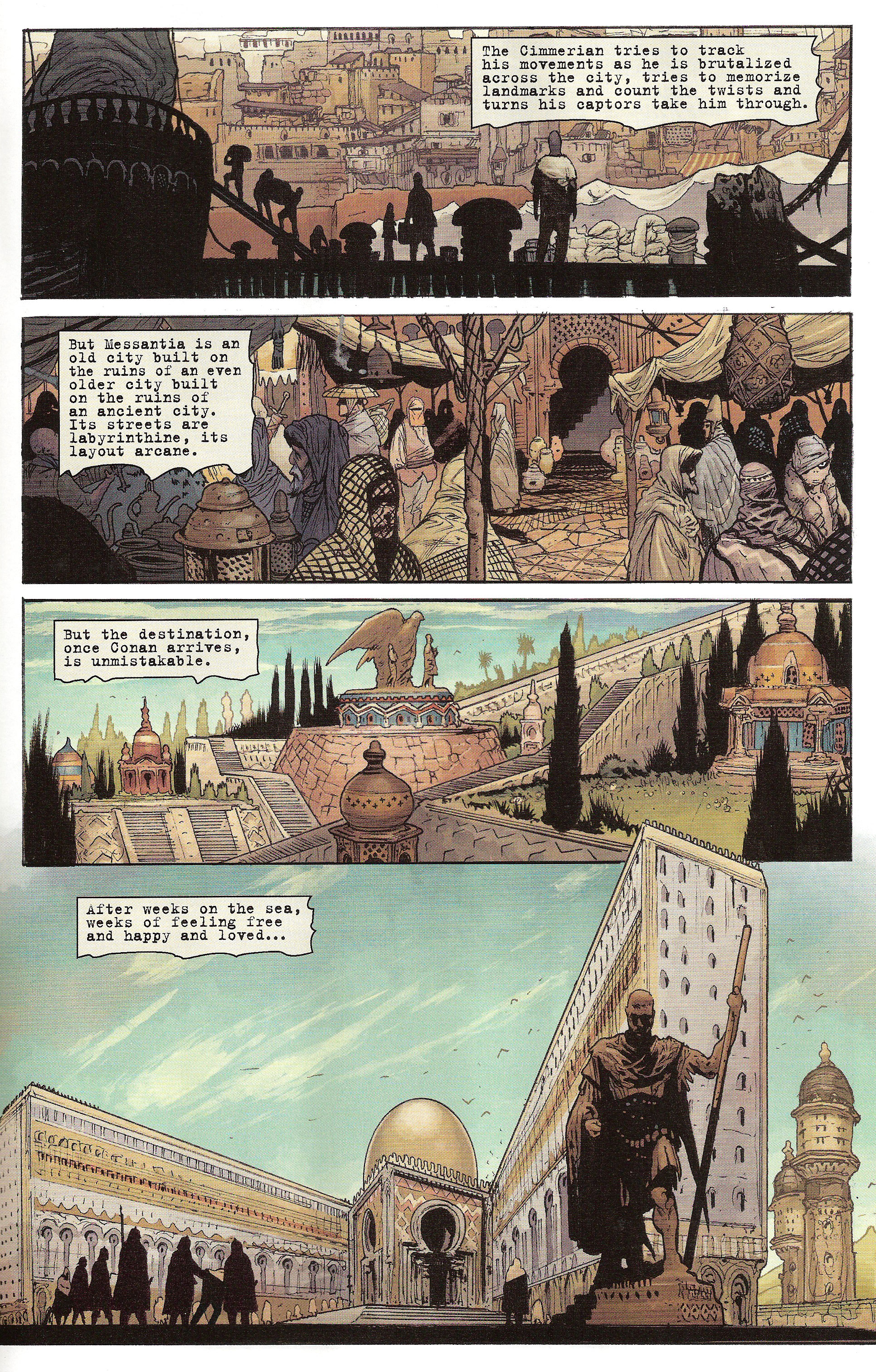
As you can see, we start out in the port where Conan has just been apprehended, we then move on to the market district before reaching the high-class section and finally the justice building where our barbarian hero will wait for his death sentence to be carried out. Notice how nowhere in these panels do we actually see Conan – except for that tiny silhouette in the last one. It’s implied that he’s transported through these various locales, but he’s never present on panel. Instead, Wood elects to focus on the city itself, showing us the places through which Conan has traveled, thus effectively elevating the background to the rank of character in these panels.
Likewise, as the issue winds down, Conan is reunited with Belît and they share an intimate moment in his prison cell. When we turn to the last page, we’re treated to this breath-taking vista of the sky above the city, looking out to the sea:
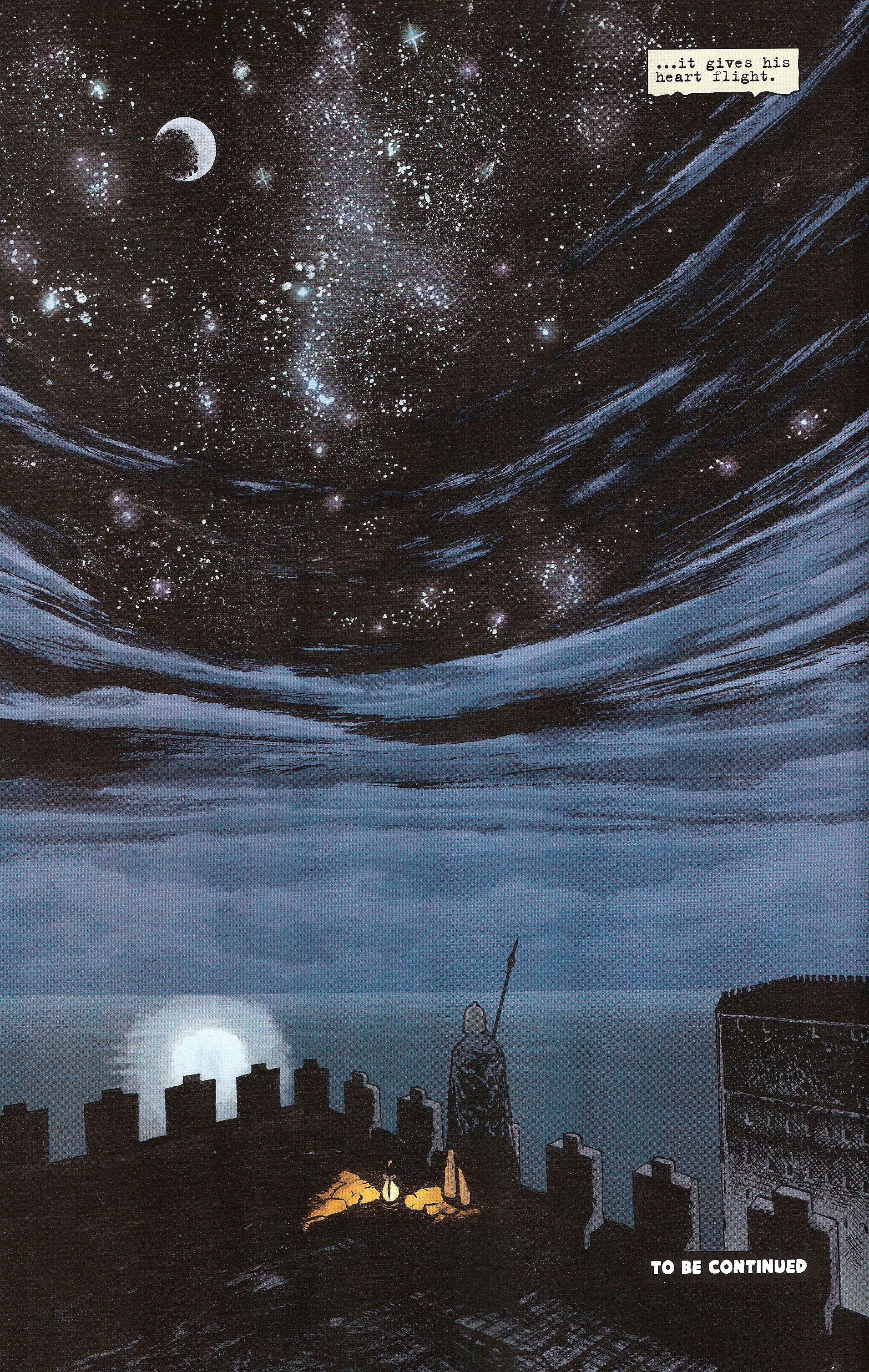
Yes, another splash page. But beyond the consideration of space, notice how this shot occupies one of the most significant positions in a comic: the last page. That’s the page that is usually reserved for a last-minute shocking revelation or a nail-biting cliffhanger. Instead, Wood devotes the entirety of this last page to a beautiful star-studded night sky, with none of the important characters in sight. This further underlines how important the city is in this story as showcasing it overrides the mechanical necessities of the plot. Indeed, Wood forgoes a stronger ending plot-wise in favor of giving Messantia more face-time.
What’s the overall effect of these decisions? As hinted above, it gives the reader a feel for the setting, the same way we end developing a feel for characters the more time they get on panel. Also, the same way we get a better grip on a character as he’s positioned in major turning points – twists, reveals, reversals and so on – we also better appreciate the importance of a setting as it’s allowed to occupy these same places.
In fact, it could be said that presence – or rather prominence – lends meaning to a story element. For a character, this will let us explore its personality. For locations however, the reader will be able to better discern its equivalent to personality, that is ambiance. By lending so much importance to the setting, Brian Wood positions himself to better establish an ambiance.
And the same way a character without a personality is nothing but a stock type, a location without ambiance is nothing but a backdrop.
Lesson Learned
If you want your locations to be more than decors behind your characters, you have to inject some ambiance into them. Setting ambiance is the equivalent of character personality and as such, it can’t be properly developed or presented without the proper space to do so. Thus, don’t be afraid to invest in some panel space for showcasing your locations. The more important you think ambiance should be, the larger your investment: splash pages, double spreads and so on. You might also consider changing the viewpoint of certain scenes, making the setting the focus of the panels instead of the characters.
MISS
The number of typos in this week’s comics
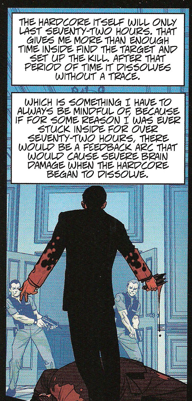
Well this is a first: this week we have three comics deserving of the MISS mention, all three of them guilty of the same sin: typos. These turn up from time to time but never in such force as this week when roughly a third of my comics had them. I’m talking about Robert Kirkman’s HARDORE #1, Mark Millar’s THE SECRET SERVICE #2 and Garth Ennis’ THE SHADOW #2.
Here’s Millar skipping a word:
Uncle Jack is almost admitting to owning ladies’ clothes there.
Here’s Ennis inventing a new word:
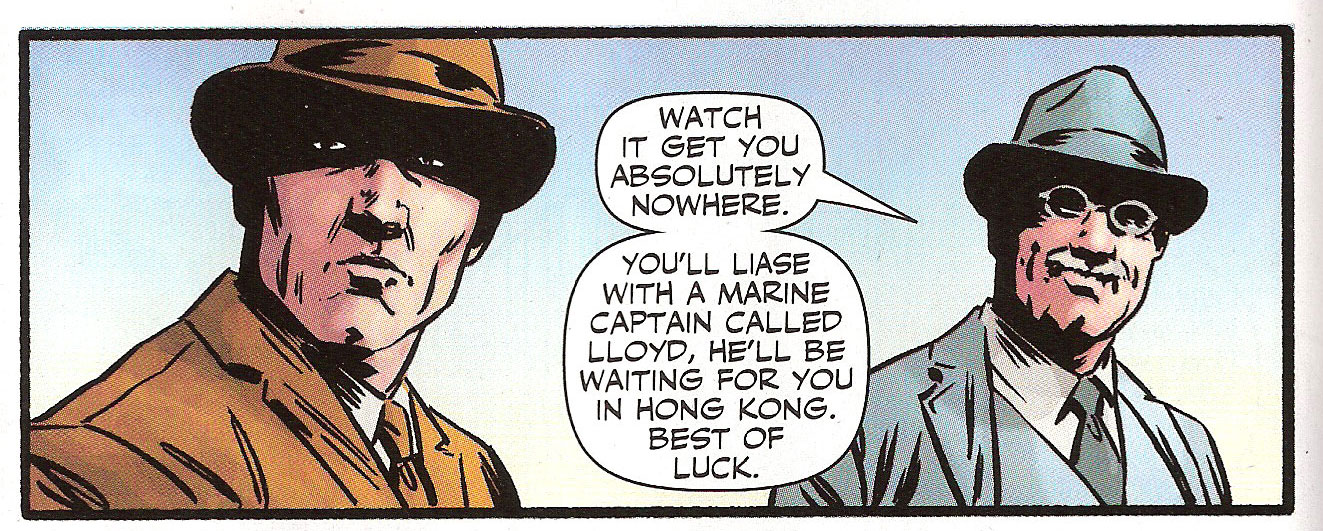
The word “liase” doesn’t exist. The proper spelling for this verb is “liaise”, further justified in that it comes from the noun “liaison”.
Finally, we have Kirkman going for the double-whammy, first with a missing letter in a word (“the” instead of “they”) and then with a missing word (the word “to” should be between “inside” and “find”):
Surely I can’t be serious, you’ll say. How can something as insignificant as a typo register as something worthy of appearing in the dreaded third section of Points of Impact? Well as I often tell my son – who is in fourth grade – the way you write is like the way you talk, the way you dress, the way you smell or the way you introduce yourself. It’s one of the ways that people will judge you. In a written medium like a comic, the way an author writes is one of the very few ways we can know him, barring having him read the thing in front of you.
Essentially, typos give an impression of negligence, of laziness, of a lack of professionalism. Even if we’re faced here with three writers who have made their mark in the industry, respected authors who have time and again amazed us with their original ideas and their brilliant execution, we can’t help but feeling let down by a defect that could have so easily been prevented.
When I read my comics and stumble upon missing words or typos, it inevitably casts the writer in a bad light and makes me re-think my interest in the series. Hell, I once abandoned the idea of picking up a new series based solely on the fact that the previewed pages on Comic Book Resources had a typo in them.
Of course, there’s also an issue of where do we draw the line? Whose fault is it really? Was it the writer’s who didn’t do a second read-through? Is it the letterer’s who worked a little bit too fast? Is it the editor’s who failed to ensure a quality final product? We could also equally share the blame between all three but the fact remains that here on Points of Impact, we look at the writer’s job and there’s certainly part of it that wasn’t done right if typos such as these could reach my unscrupulous eye.
Oh and since karma is such a… difficult person, I’m sure a few of you will point out the typos I left in this.
Bonus points if you’re either Kirkman, Millar or Ennis.
Lesson Learned
When you’re done writing, read it all again. Then let it sit for a while – maybe a day. Then read it once more. Then maybe another time. Then make a few other people read it. Then read it yourself one last time. Have it read as much as you can before it hits the printer and you won’t have to worry about those pesky typos or even missing
That was a joke, people.
Honorable Mentions
- Nathan Edmondson (yes, him again!) shows us how to seamlessly and organically integrate characters’ names into the dialogue in THE ACTIVITY #6.
- Reminiscent of what Ienco did with EPIC KILL #1, Jonathan Hickman offers us a glimpse into a character’s fractured psyche in THE MANHATTAN PROJECTS #3.
- Brian K. Vaughan’s character development is so good in SAGA #3 that he can get away with a soap-opera cliffhanger in a sci-fi series.
Dishonorable Mentions
- The main character has events happening to her instead of provoking them in J. H. Williams III and W. Haden Blackman’s BATWOMAN #9.
- There’s a character in Robert Kirkman’s HARDCORE #1 who asks for background information. Later we find out she already knew all of this so this was all blatant exposition for the reader.
- Night of the Owls roundup! Duane Swierczynski’ BIRDS OF PREY #9 was nothing but one point plot at the end preceded by numerous pages of filler (including recycling a location for no reason valid to the plot). As for Scott Lobdell’s RED HOOD AND THE OUTLAWS #9, it had its characters spewing so much exposition that it makes a better guidebook than a story. Now I know why I usually don’t pick up these titles.
So there you have it. That should tide you over till next week. See you then!
Related Posts:
Category: Columns, Points Of Impact


On the mistakes: traditionally in prose publishing, I’m guessing this would be the responsibility of a copyeditor.
On spelling, at any rate, Tor editor Teresa Nielsen Hayden says “Spelling and writing are unrelated skills. The ability to spell is as variable in authors as it is in the general population.”
http://nielsenhayden.com/makinglight/archives/008777.html
Very interesting article, Scott, Thanks!
Teresa Nielsen Hayden makes a very good point. Indeed, the ability to conceive compelling characters and enthralling stories is wholly different from simple spelling. I’m sure literary history is rife with anecdotes of deep and successful authors who would have been shamed out of the craft if not for the tireless efforts of their editors and proofreaders.
In any case, I wasn’t too sure about including the notion of English missteps as a MISS this week, but I feel like it’s an issue that needs to be aired out once in a while, not as much to point fingers – as I may have tangentially done – but to underline how it’s mostly of matter of how the work is finally perceived by the readers.
For my part, stumbles such as these put me off. Others are probably far more lenient. Others still might not even see anything wrong. I believe it reflects badly on the character of both the author and the work while I’m sure a lot of people are able to separate the two.
There’s a good debate to be had about this. What do you think, Scott?
What about anyone else? What do mistakes in comics – missing words, typos or otherwise – do for your appreciation of a comic?
Misspelling words takes away from the quality of the final product. If you’re asking someone to pay for your comic, the least you can do is proof-read your work.
That being said, I understand accidents happen. I feel sympathy for those poor creators who’ve discovered a typo in their final work and are now kicking themselves in the ass.
Yannick, first of all, it’s great to see someone else dissect the medium as much as I do. Secondly, channeling Scott McCloud is always a good thing. And finally third, yeah, it isn’t necessarily the writer’s mistakes that appear as the letterer or copy editor (or editor on smaller publications) would and should catch these faux pas’s. I’d say it’s entirely their fault, especially the editor’s.
I’d love to compare notes sometime on our interpretation of select images or sequences. Like minds, m’man.