
Points of Impact – Week 4: Adding Another Dimension
![]()
April 2012 – Week 2
Welcome to yet another edition of Points of Impact, the not-quite-reviews that make you write comics instead of reading them!
Again
- The BULLSEYE! section presents something that really wowed me. That’s usually when a writer does something unique among his peers.
- The HIT! section picks up on a cool trick that gets used pretty often – mostly because it works – but of which I’ve found a prime example.
- The MISS section however isn’t about praising a good shot but – as you guessed it – pointing out where a writer stumbled so you don’t put your feet in the same hole.
And for the caveat du jour (yup, Latin AND French – sophisticated!): this column is eminently spoiliferous so go read your comics before coming back here!
BULLSEYE!
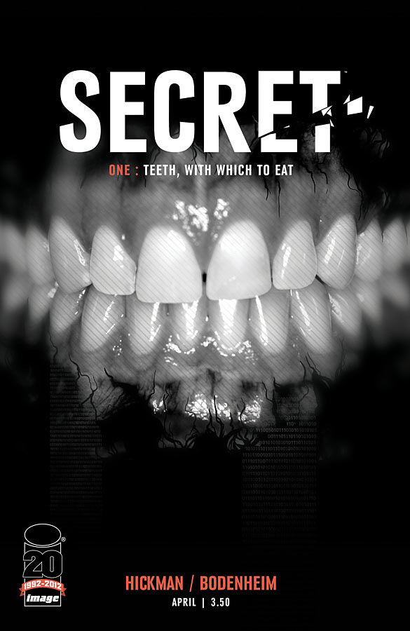
The use of color as a storytelling device in Jonathan Hickman’s SECRET #1
 Color is often something us word-minded folks tend to take for granted. I mean, once the pencils are done, we still keep our interest in the project but – let’s face it – at this point, it’s more about the thrill of seeing the comic come alive than about injecting any more creative input. We’re all more or less guilty of letting go past the drawing stage and of thus underestimating the power of other components of the comic for telling the story.
Not Jonathan Hickman though as he proves it with issue 1 of SECRET. In a mood similar to his breakout hit THE NIGHTLY NEWS, this new ongoing series tells us a story that once again takes us down into the murky waters, where the great sharks of our civilized world swim and hunt. SECRET speaks to us of fear, distrust and – not too surprisingly – violence, the whole lot awash in disconcerting colors.
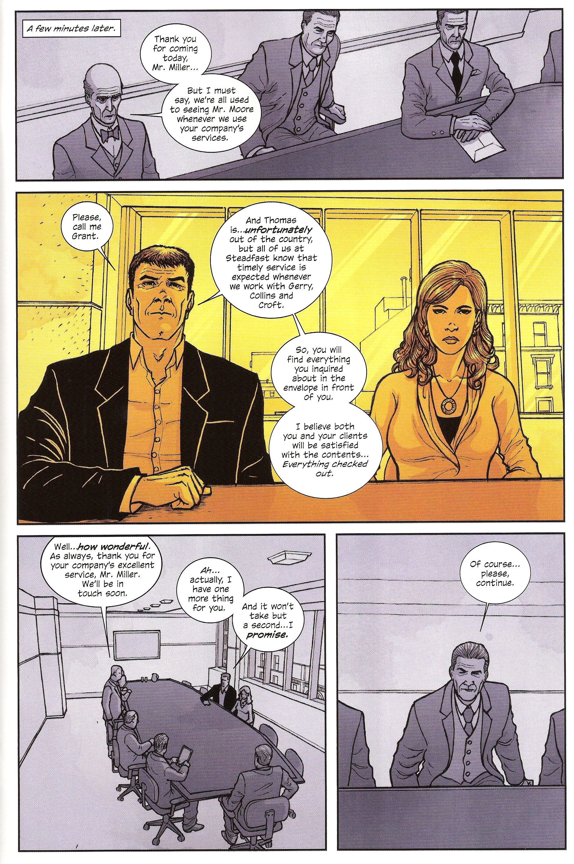
Before we go any further, let’s break the comic down into its different scenes and have a look at their corresponding colors:
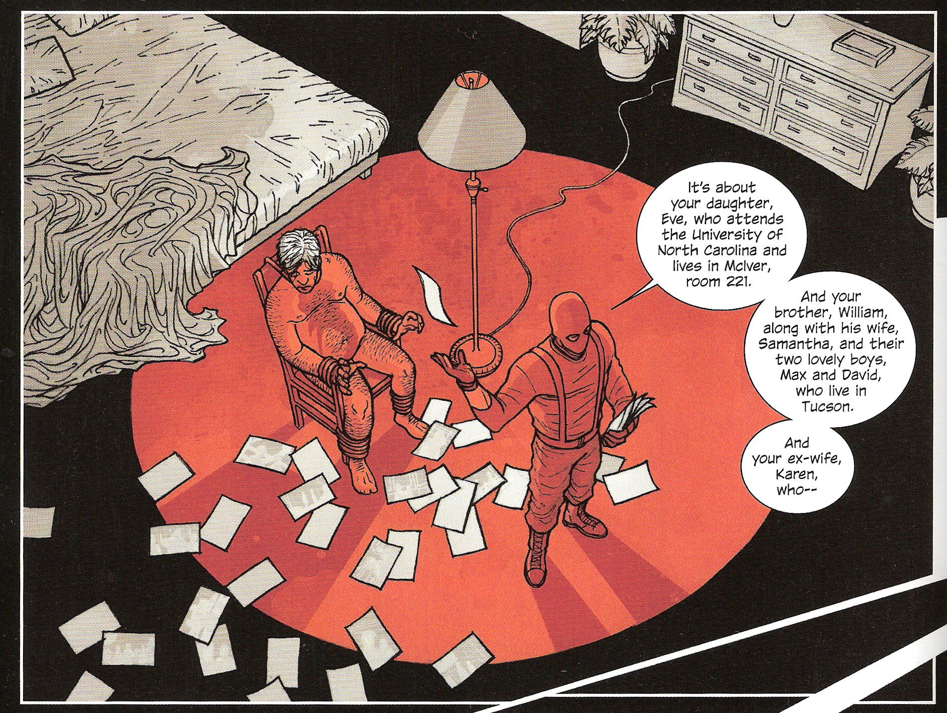
- Page 1 – A sleeping Dunn is woken by a masked man (whose identity we learn later in the comic). Color: Grey with a first splash of red.
- Pages 2-4 – Dunn is tortured by the masked man. Color: Grey with red accents.
- Pages 5-8 – Titles
- Pages 9-10 – Dunn asks for help from his lawyer Gerry. Color: Green.
- Pages 11-16 – The meeting between the directors from Gerry’s law firm and Miller and his lovely assistant. Colors: Purple and yellow.
- Pages 17-18 – Moore (Miller’s boss) gets killed in London by an unknown man (whom we can supposed to be same one who tortured Dunn). Colors: Grey with red accents.
- Pages 19-21 – Dunn meets with Miller who offers him the services of his security firm. Color: Green.
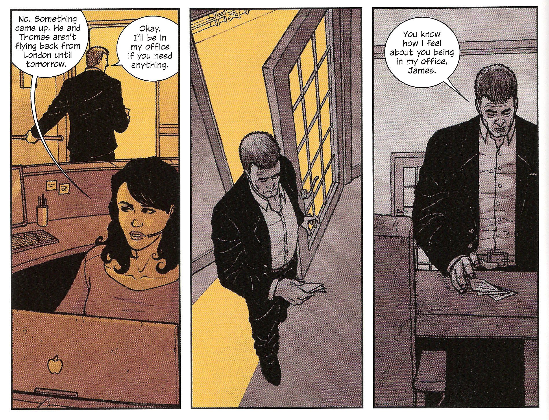
- Page 22 – Miller comes back to the office. Colors: Yellow and then grey.
- Page 23 – Miller talks with James. Colors: Grey with one yellow panel.
- Page 24 – The big reveal. What? You thought I’d say everything? Gotta give you some incentive to go read it! Color: Orange.
We can already guess that there’s a certain logic in the selection of colors. Before I go into the mechanical details, allow me to try my hand at a bit of interpretation. Looking over the data above, it seems to me as if the different hues’ purpose is to designate in which world the character is standing at the moment, not as much in a physical sense as in a more abstract sense.
First, you have public colors: green, purple and yellow, each of them representing a facet of the business word, respectively: finance, law and security. That’s why when scenes revolve around Dunn as a businessman, the dominant color is green. In the meeting on pages 11-16, both sides of the table represent their own domain : the lawyers on one side in purple and the security consultants on the other in yellow.
As for the color grey, I think it represents a neutral world, a more primal setting where the masks can fall and people can interact without the hindrance of social convention – hence the use of a non-color . You’ll notice that grey is used in scenes where make-believe is useless: torture, murder and conspiracy. Notice how Miller passes from the yellow world of the reception area of his firm to the grey privacy of his office. The same way, the panel turns yellow when his conversation with James is seen from outside the window. The grey area is also where violence erupts in the form of the red accents.
As for the color orange? Well let’s just say this is the color you get when you mix yellow and red, and leave it at that
Of course, this is all conjecture as I don’t claim to have just climbed out of Jonathan Hickman’s head, but I’m confident to maybe have gotten some of it right. I’m also fairly certain that SECRET #2 will prove me wrong on many points!
POP QUIZ! Jeremy! Still hanging around? What’s your theory?
But beyond any theories I might posit, one thing is sure: Hickman has made of color a premiere tool in building his story. For now, it’s hard to say just what the rules he’s using are. At this point, he’s pretty much just setting up the color-coded system and still hasn’t had time or space enough to really play with it yet. We can however assume that’s he’s following a certain set of unspoken rules and that these will surely become clearer as we read further issues in this series. That’s some interesting reading coming up in the next few months, courtesy of Jonathan Hickman.
In any case, if you have to take anything tangible away from this BULLSEYE, it’s that your storytelling tools are not limited to your dialogue and the artist’s drawings. There’s great potential lying in the other contributions from your creative team: inks, colors and letters have a story to tell too.
Lesson Learned
Dialogue will move the plot along and establish characters while art will breathe life into your script and truly make a story out of your plot. You can find yourself with a very fine comic using these two conjoined arts but why not add another dimension to your storytelling approach? Color was used in the above example, but why stop there? Inking is another likely candidate and lettering has already proven a very efficient tool for adding layers to a narrative. The only thing you have to look out for is consistency: if you start ascribing meaning to things like line weight and speech balloon shapes, you need to set yourself some rules and make sure to follow them. Otherwise, as soon as you break those rules, the underlying meaning will simply cease to make sense.
HIT!
The recycling of the same panel in Brian K. Vaughan’s SAGA #2
 Same shot are words that editors sometimes dread to see in a comic script. As we’re often encouraged to vary the camera angles we ask for, relying on the same shot multiple times in a row can lend an air of staleness to a scene. Remember when we looked at that page from FATALE #4 last week? Now imagine it with half of it being the same front shot of Josephine sipping her coffee at the counter and you’ll get what I mean.
But there’s a way to make use of the same shot and still make it interesting, as Brian K. Vaughan demonstrates in his latest issue of SAGA. Right after the opening that sees our heroes battling gropy animated vines and sharing embarrassing secrets, they elect to have a little sit-down while the kid sleeps and – as most of you who are parents have experienced without having to be on the run for three days – almost immediately fall asleep themselves.
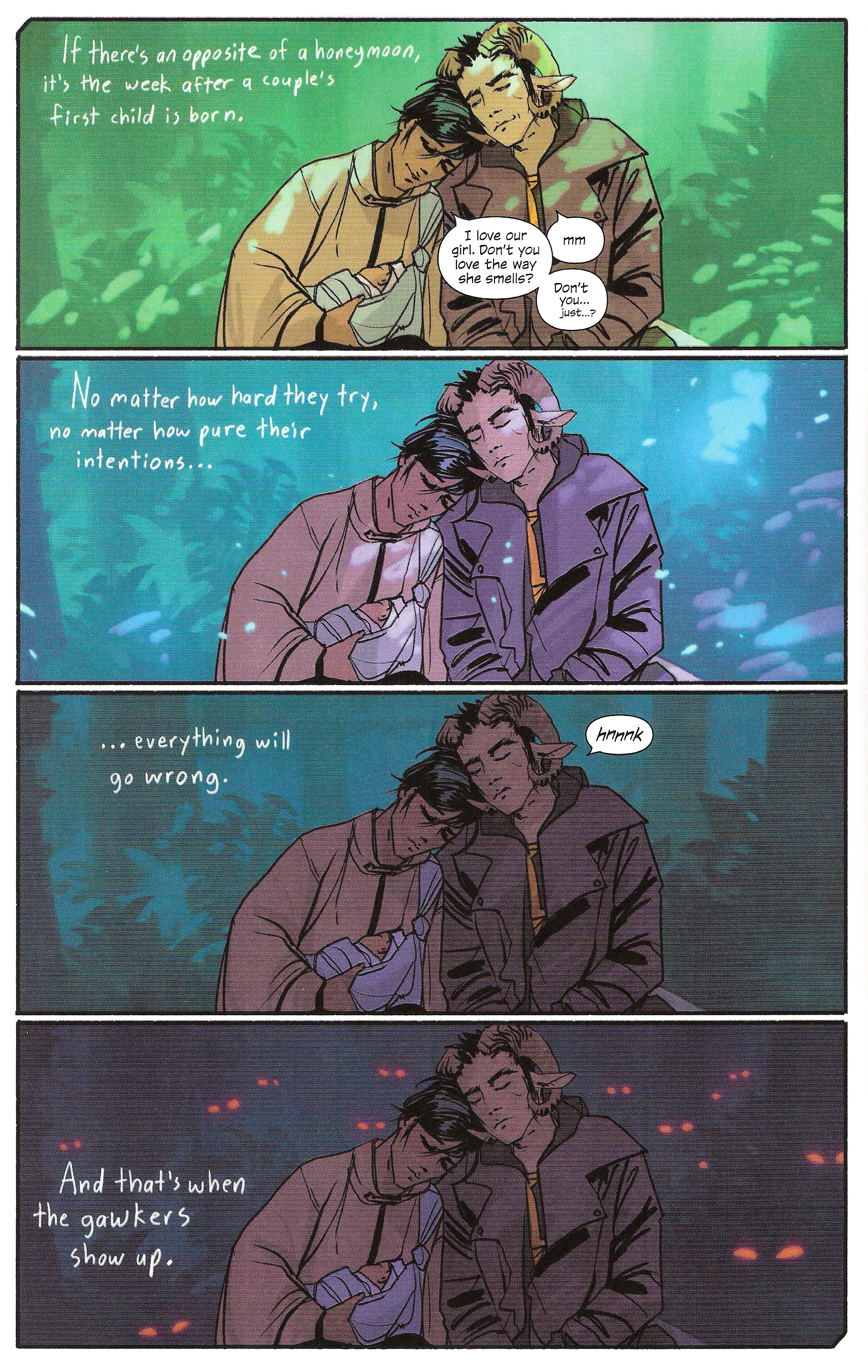
We have basically the same shot in all four panels: a front medium shot of Alana and Marko sitting on a rock, leaning against each other, Hazel in her mother’s arms. In the background, the lush greenery of the forest. Both of the parents have their eyes closed. These elements remain unchanged all the way down the page. What does change however are the ambient light and the background (and Marko is kinda smirking in the first panel, if you really want to get technical about it):
- Panel 1 – Bright day, light green-tinted background.
- Panel 2 -Twilight, bluish-tinted background with dancing dust motes.
- Panel 3 – Evening, dark green-tinted background.
- Panel 4 – Nighttime, blackened-out background with glowing red eyes.
POP QUIZ! Conner, can you give me five other examples of ways to indicate the passage of time in comics?
What this does is focus the reader’s attention on the passage and effect of time by essentially taking the characters out of the equation, yet without actually making them absent. So, in a sense, the setting becomes the central character for a short time because its actions become the ones advancing the plot.
What it also does is give meaning to the elapsed time since it is literally shown. The fact that Alana and Marko spend so much time sleeping in that place has a definite bearing on the story. It’s what makes it possible for the bounty hunter to catch up with them and allows Vaughan to once again bank on the established fear of the Horrors that come out at night. If a simple caption had been used, we couldn’t feel the weight of all that wasted time and we couldn’t properly appreciate the fear that comes with the appearance of all those ominous pairs of eyes.
As you can guess, using this technique willy-nilly– for simple scene transitions, for example – will appear as useless padding. Indeed, why waste a whole page when a simple Later caption would do? Once again, we see how economy of space and the judicious spending of your panel count are essential to maintaining good pacing for your comic.
Lesson Learned
Consider reusing the same shot multiple times when you need your reader to focus on the passage of time. To do so, set your characters as a static center for your panels, thus anchoring their presence in the scene. The fact that they’re not moving for several panels should render them practically invisible to the reader. Next, in each of the panels, change background variables that can act as a time indicator. Most importantly, be wary of overusing this trick! Reserve it for those times when showing the passage of time is a meaningful plot point of your story.
MISS
The holes in Mike Mignola and John Arcudi’s plot for LOBSTER JOHNSON: THE BURNING HAND #4
 Deep down, I’m a pretty forgiving guy. Unlike what I might let off in some of these columns, as long as a comic entertains me, I let a lot of stuff slide: pacing problems, lack of characterization, simplistic plots – heck, I can even disregard typos if you catch me in a good enough mood.
What gives me real trouble however is when a plot is riddled with holes.
Mike Mignola and John Arcudi – whom I had chided for #3– do it again this month with the penultimate part of LOBSTER JOHNSON: THE BURNING HAND. The issue I raised last time is still present – the hero is an insubstantial wisp of a character compared to the others – but they’ve compounded it with a new problem: things that make you go Huh?
Right out the gate, the comic trips on its own feet. As our female journalist lead looks agape at the burning shell of the building she just left, she steps out of the phone booth, leaving her editor at the other end of the line shouting in panic. The page ends on a stranger’s hand hanging up for her. Who is this mysterious call-ender? What are his nefarious goals? Does this spell danger for our intrepid heroine? Beats me. The next page sees a new scene starting in the Lobster Lair. When we do come back to the scene of the fire, there’s an unknown extra (whose face we never see) using the phone booth to talk to the cops. The ominous close-up on his hand served no purpose other than meaningless confusion.
Later on, when LJ is attacked in his base by the gangsters, one of them shoots him point blank with a submachine gun and misses. We can actually see the shots going past the hero’s body. Since it’s never established that he is nothing more than your superpowerless classic mystery man, we’re left to assume that this is just the effect of sheer luck and leave it at that. No other explanation is provided.
Then as one of Lobster’s men, Harry, attacks the Ghost Rider mock-up, something happens with an arm wave and a gush of black flames but I’ll be damned if we get to know how that works. The end result is one heroic ally on the ground and that’s all we get.
But the cherry on top of this unstable sundae is the canon. Now we’re talking about a canon that fires four-inch shells . This isn’t a WW2-era machine gun nest, it’s an artillery position! That canon is bolted down to the floor, inside the base, pointing further inside the building and – you better sit down for this – kept loaded. Yes, they’re keeping a loaded artillery gun indoors and point it at themselves.
Although they did keep it under a tarp so that should mean something for the OSHA.
Lesson Learned
Always make sure that your plot points are both logical and justified. Logic will ensure that your reader doesn’t get thrown out of the book with questions such as Why is he doing this? , Where does this come from? or How can this be possible? You could in fact use these three questions to fast-check your plot points in a reliable way. As for justification, it helps making sure that you’re not introducing meaningless elements to your story. Real life is full of coincidences and purposeless events and that’s quite alright since it’s not supposed to be guided by a creative hand. Stories however are, and comics even more so because the physical limits imposed on the medium demand that anything extraneous be culled. Naturally, your reader will ascribe meaning to almost anything you introduce, so make sure what you show actually has some.
Honorable Mentions
- There’s a beautiful sequence of aspect-to-aspect transitions in Brian Wood’s CONAN THE BARBARIAN #3 as the day winds down and we’re introduced to a quiet moment on Bêlit’s pirate ship.
- Kurtis J. Wiebe calls for inset panels to decompose an action scene in PETER PANZERFAUST #3 and it’s a beauty to behold: perfectly clear and exciting!
Dishonorable Mentions
- J. H. Williams III and W. Haden Blackman seem intent on continuing serving their story using the most impractical and confusing structure possible as we once again bounce from flashback to flashback and from viewpoint to viewpoint in BATWOMAN #8. This story arc ends next month, right?
- Nothing is ever perfect down here! Jonathan Hickman had an oopsie in SECRET #1 when he misspelled a word. I’ll let him share the blame with his editor on this one.
And that’s all I wrote. Come back next week and I’ll have some more!
* * *
 Yannick Morin is a comic writer, editor and vivisector hailing from the frozen reaches of Quebec City. You’ve just caught him with all of his endeavors being drawn by artists right now. You will however soon see his work in IC Geek Publishing’s JOURNEYMEN: A MASTER WORK anthology (spring 2012) as well as in ComixTribe’s OXYMORON anthology (fall 2012). Of course he also has a few other projects on the side but it’s all very hush-hush at this point as you can imagine.
Apart from complaining about running out of time for writing, Yannick also acts as ComixTribe’s Digital Comics Manager, making sure the electronic shelves are well stocked with the Tribe’s offerings.
For more of what spills out of his brain, have a look at his blog Decrypting the Scripting. You can also feed his ravenous ego by following him on Facebook and Twitter.
Related Posts:
Category: Columns, Points Of Impact


I find Hickman’s Secret to be a very interesting example as I’ve heard some interesting discussions regarding the importance of color theory which I believe are supported by Hickman’s choice of colors for each “type” of scene.
Do go on! You got me interested!
Well I was mainly referring to the ways certain colors are believed to affect emotions and – on a simpler basis – the things that we have come to associate colors with.
Some of the things that come to mind include the color of paint in hospitals, for example.
Most of this thought just came from what little experience I have with film and the way one can tint a scene (much like in comics) for various purposes.
I think you’re on to something, Jeremy. I’ll do another read-through and see if there’s any link between the emotional value usually ascribed to colors and the content of the scenes.
Thanks!
Please! Glad you think there’s something there, haha.
This is a fantastic column. Extremely helpful for writers who are trying to learn the trade, especially the in-depth look at various panel transitions. Thanks!
I’m glad you like the column, Chris! I hope I can go on being helpful for a long time. Thank you for reading!
Great stuff, Yannick!
I noticed the color work in Secret but I think it was more subliminal during my first reading (I was caught up in the story. It was my pick for the week!) but your breakdown felt dead on.
The Saga sequence was great and showed that even the same image can show a passage of time and a switching of emotions.
Looking forward to the next column!
Thanks, Wes!
I feel like the “key” to understanding how Hickman uses color won’t simply be given to us. I think it will take some time and quite a few issues before we can infer it from the story. Still, it’s great fun in the meantime and it shows us how we can use other aspects of the medium for storytelling purposes.
Oh and thanks for the shout-out on Twitter yesterday! 😉 Is the second installment of your own column out yet?
I agree that time will tell. I’m super excited to see how they carry this color motif into future issues. I could also be a fun foreshadowing device.
Installment #2 of the column is up today over on Fanboy Buzz. This time with some meat to it, now that introductions are out of the way!
Best!
I have to say I find it strange that you’re talking about art in your “Bullseye” and “Hit” but don’t mention the artists at all.
Actually, Points of Impact is a lot more writer-centric than the other opinion pieces you find out there. Part of the reason is that this column is mainly about the script behind the comic – kinda like reverse-engineering the comic you’re holding into it’s pre-art form. Hence, when I mention the art, you’ll notice it’s more as an actualized form of a script element rather than as an object of analysis in itself. That’s because the reader doesn’t have access to the script, only the comic. The final art is the only form in which he’ll be able to “read” the panel descriptions that led to the art.
The other part of the reason is that I don’t consider myself nowhere near competent enough to analyze an artist’s technique, only the writer’s requirement that it brought to life. So when I talk about the backgrounds in SAGA’s panel, it’s a way of talking about the indications Vaughan gave Fiona Staples for drawing those backgrounds – indications we can only *assume* exist but which we must for the purpose of this column. I don’t do it to to look over her use of framing, perspective or anatomy which are concepts that sadly elude me.
And that was a lot more long-winded that I had planned! Sorry!
You do however bring up a very valid point in that artists – heck, the whole creative team should be recognized for their contribution, even though it’s the writer’s craft we’re more concerned about here. Tell you what: starting with tomorrow’s Points of Impact, I’ll credit the whole team for all three main sections: Bullseye, Hit and Miss.
Thanks for taking the time to comment, Ben! Very much appreciated!