BTP: The FIVE C’s of Pin-up Art
Welcome back to Breaking The Page, where I look at the world of comic art, both sequential and through the single image. It’s been a while since my last posting, but in that time I’ve decided on ways to re-approach the column that will be more of a fluctuating, ever-changing model than what I’ve previously established. In other words, there isn’t going to be a regular format, but rather something new and unexpected each and every time. It’s my voice after all, and I’ve got lots to talk about!
As I start with a new look, I’ll be concentrating this particular article on what I call the FIVE C’s of pin-up art. Let me break it down for you:
The CONCEPT is the basic idea or premise for the piece. Most often, this is the very first step, but you’d be surprised at how often it isn’t. I’m going to use a written sample to start this article off, one which you artists are welcome to use yourselves: Batman fighting the Joker.
CONTEXT works around the setting and situation that the idea will take place under. In the case of the Batman example above, a dimly lit alleyway in Gotham City with the Joker about to hit Bats over the head with a sledgehammer is the context.
CONTENT talks about the components of the image, whether it’s people, buildings or other landscapes, props such as cars, lampposts, and weapons, or anything else that will play a role in the presentation of the pin-up. For the Batman piece, you’ll need certain content, such as the obvious Caped Crusader and Clown Prince of Crime, the sledgehammer, the garbage bin from behind which ol’ clown-face will be stepping out from, the brick wall and it’s condition of graffiti and dirtiness, and finally, the light source that will be lighting up the focus of the image.
CHARACTER is a key component as this is how we determine the natural body language and action/reactions of the character to a given situation. Batman, for instance, would be looking around suspiciously with a scowl on his face, standing firmly and unwaveringly on the ground in preparation for whatever comes next. The Joker, on the other hand, has his eyes wide open and a maniacal grin on his face as he prepares to bash Bats in the skullcap.
Finally, COMPOSITION deals with many aspects of the drawing, such as staging and positioning, foreground/middle ground/background, leading lines, patterns and shapes, lighting, and topics such as the Rule of Thirds (or the inclusion of an invisible nine panel grid over the single image), which is used most often in photography. In this Batman image, we’ll place the components in this order with the brick wall as the backdrop: On the far left to the first vertical 1/3 line, we have the garbage bin, then the Joker centered in the picture, followed by Batman on the 2/3 line dividing his body in half. Bats is in the foreground about three feet away from the side and front of the garbage bin, and Joker is in the background in the middle of the page holding the sledgehammer near the end of the handle over his head. Batman is blocking most of the Joker’s body. Bats, in the foreground, is basically a bust shot from the chest up, so he’s close enough to us that we’re almost part of the upcoming incident. The light is mainly on the Joker’s white face. Oh, and for the graffiti, let’s put the word Anarchy right next to the sledgehammer head on the right of the image.
Going quickly back to a previous comment before we continue, the concept isn’t always the first step just as how, in writing, the idea isn’t always the beginning. In writing, for example, I know that I’ve started with a phrase of dialogue in my head that just had to be vocalized and have built a story around that. In art, sometimes composition will manifest itself first through a particular design that feels the need to be drawn and the piece takes form from that.
Everybody clear on the Five C’s so far? Great. Let’s move on to some actual artwork, shall we?
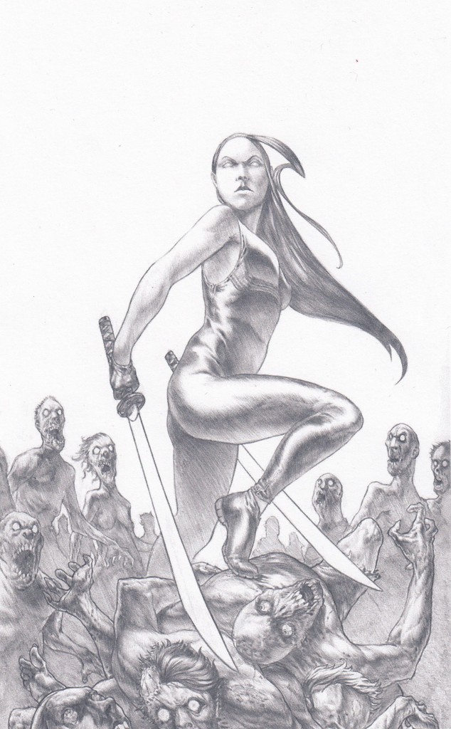
We’re going to start with a piece from Ben Garriga, who is known as Graphitenightmare on DeviantART. The concept is a female ninja battling the undead. The context itself is that she has defeated a number of the zombies, but is still surrounded by many more waiting to attack. Content is pretty simple in that you have the undead, the female ninja, and her swords. No buildings or structures to speak of to give us an indication of locale or conditions, which is fine for a pin-up.
Now, before we go into composition (which is a real treat to look at through the leading lines), I want to talk a bit about his use of character, which is basically the only thing that is lacking in this piece. Let’s start with the undead. A good number of them have been piled up with the ninja standing on top in victory, but the zombies that are standing around her are doing just that: Standing. They aren’t attacking nor do they have their arms up reaching for her. They’re just staring without action, which is completely uncharacteristic of these creatures. Also, those stacked in the pile have supposedly been through a fight, and yet they aren’t missing any limbs. That’s one strike. The second strike is the ninja herself, who, again, is standing on the pile of bodies, triumphant. The problems exist in where her gaze is directed, which is straight ahead of her at that higher elevation or down towards a camera, and her posture, which, again, looks like she’s posing for the camera. We don’t need to have action in this image, but what we do need is acknowledgement that the threat isn’t over and that she is ready for more, meaning that her stance should be one of preparation and her eyes should be aimed towards the incoming onslaught. Two strikes, but he’s not out yet.
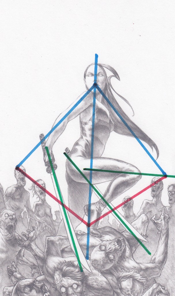
Here’s where Ben has hit a homerun. His composition is absolutely gorgeous! First look at the blue lines, one straight through the posture of her body and the other two creating a triangular shape. Now look at the red lines, following the zombie heads on either side of her, making the funnel shape and better yet, the base of a perfect diamond form. Beautiful. He didn’t stop there, however. Take a gander at the green lines that follow the sword blades and her upper thigh, all leading to the bottom right portion of the image like machine gun fire. Finally, look at the balance of the image, with all of the weight on the bottom and the negative space up top. I tip my hat to you, Ben.
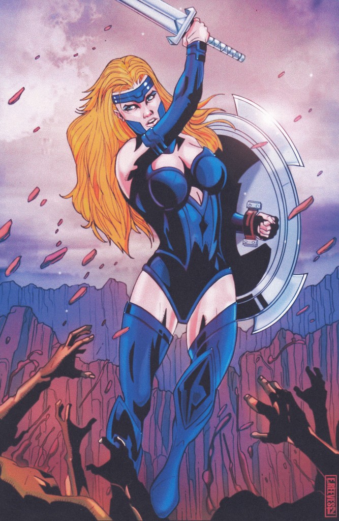
You aren’t alone, though. Next up is a character pin-up of THE RED TEN’s Bellona by Erik Reeves, creator of such titles as HOODRATZ IN SPACE. Just as an FYI, you’ll be seeing this piece as a page in an upcoming project from ComixTribe in 2013, so watch for what other goodness comes from us on the publishing schedule. So we have the concept being Bellona fighting an army singlehandedly. The context? A battlefield in what seems to be a canyon, making it pretty damned hard to get out easily. Content of the image includes our main character, a horde of soldiers, and a sword and shield, with the canyon walls in the background. Here’s where character comes into play. This is a Wonder Woman-esque warrior, and we don’t see her standing waiting for the fight to come to her. She’s in there jumping into the fray, attacking everything and everyone in sight, so he’s got the character pretty well established. Success so far, but how did Erik do compositionally? Let’s take a closer look.
First off, look at the blue arc that follows from her head down through to the tip of her left foot. Great stuff. Next up is the green #2 shape that goes from the sword along her right arm and out from the shoulder to her left hand. Then we have the red lines following the outstretched arms of the soldiers at the bottom of the image. Do you see where they converge? That’s right, on her hip. And just as we did with Ben’s ninja picture, look at the balance as the tops of the canyon wall split the page in half, with all of the weight low down. Freedom is denied these soldiers at the hands of this warrior woman. Kudos, Erik.
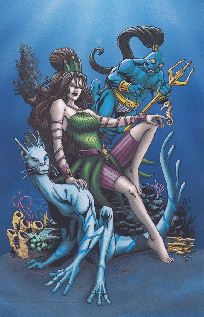
Lastly for this article, we have another character from THE RED TEN, Mazu, drawn by series co-creator and penciller Cesar Feliciano. Watch for this piece to appear in that very same title I mentioned before. 2013 is a big year for the Tribe, and this is just a glimpse of what you can expect. The concept, again, was simple: Present this water-based character in a casual manner. Context is the deep blue sea during quiet time. Content? All of the makings of a makeshift underwater throne, along with Mazu, her two cohorts, and other expected items you’d find under the sea. Character is established through her posture and facial expression, as are the positions of her supporting characters. She’s laid back and not a natural aggressor. They figuratively (and literally, in this case) support her. All of those components are there in this piece. Now for the composition.
The first obvious things I notice are the places where I put the green lines, with the main leading line being from the upper left corner of the image to the bottom right, straight through her body through the positioning of her relaxed posture. Again, similar to the ninja piece, we have the three lines existing in the position of her two arms and the aforementioned posture. Notice the S that follows from her right shoulder in through her arm and into the left arm of the creature beside her. Excellent. You then have the two red lines coming from the upper right area from the eyes of the above being and through his trident to their respective ending points, but what got me was the blue line. Initially we can see that it follows the form of the lower creature. That said, it actually continues up both sides of the image creating a beautiful U shape. As for balance, look at the amount and location of negative space all around the figures. Incredible work, Cesar.
Let it be known that as an artist, a lot of the time composition isn’t planned, but look at what CAN happen when you design your page. Like sequential art, much of it is intuitive, but has a basis in learned knowledge.
One aspect of composition that I didn’t deal with in this article is the use of color, mainly because I wanted to place the focus on the penciling, so perhaps in a future piece, n’est-pas?
In closing this article, I’d like to reiterate that the Five C’s are a real and important part in developing your finished pin-up. Some points automatically happen while others may take a bit more thought, but if you plan out the stages, consider your composition through thumbnails, and take a step back to admire your handiwork, you’ll be pleasantly surprised by the talent you didn’t realize you had.
Thanks go out to Ben, Erik, and Cesar for allowing me the pleasure to use their work as great examples and a special thanks go out to you, the reader, for spending this time with me. We’ll see you again for another breaking of the page!
Click here to make comments in the forum.
Related Posts:
Category: Breaking The Comics Page, Columns











Comments (1)
Trackback URL | Comments RSS Feed
Sites That Link to this Post