BTP: Scene-To-Scene Transitions Made Easy with the Match Cut
Creative scene-to-scene transitions are a passion of mine. Whether it’s watching the fluidity of motion pictures or the implied flow of graphic narration, both have elements and methods that allow the viewer/reader to coast from one scene to another without coming to a complete stop. This, in film, is called continuity editing, but that first word, continuity, is what allows for that continuous momentum. In the comic medium, just as in film, the technique is called match cutting, and there are actually nine different ways to convey that smooth transition between two scenes:
1) Segue
2) Parallel Images
3) Similar Concept
4) Similar Element
5) Image Completion
6) Motion Completion
7) Mirror Images
8) Fades, Blacks, and Lights
9) Text
Even though I’m going to be presenting a variety of examples to guide you through the different methods, I’m also going to tie everything together by using one sample of back-to-back scenes, those being of a woman in her kitchen and a man, her husband, sitting in a bar. The situation: The woman is worried because her husband is late coming home from work and it’s not like him to not call, but he’s trying to avoid going home as he’s just lost his job and is afraid to tell her. In each of the above nine methods, I’ll be explaining how each technique can be applied. But first, some descriptions to go with the terminology:
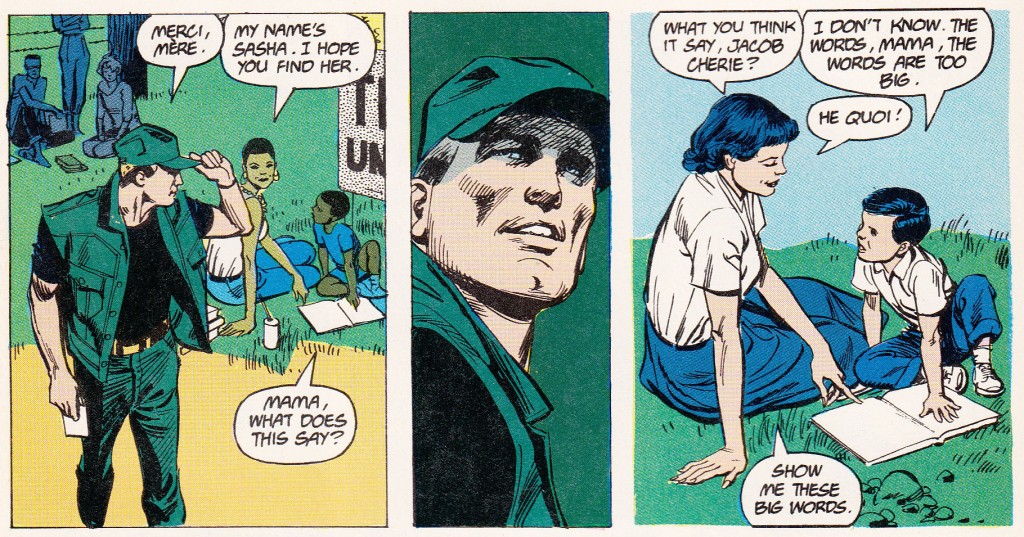
A SEGUE consists of no less than three panels, with the first and last being of the conjoining scenes and the middle image being the connection that applies to both. For example, in this particular segue taken from DC’s CINDER & ASHE (back from 1988), Jose Luis Garcia Lopez introduces Jacob Ashe talking to a woman who is reading her son a story in the first panel. The second has a close-up of Ashe, as he reflects back to the situation in the third panel, where his mother would read to him. By having this common element of Ashe in both scenes, Garcia Lopez was able to bridge that jump seamlessly. In the case of the wife and husband in our story, the woman has a glass of water sitting in front of her on the counter, we close in on the glass, and then pull back to show the man with a glass in front of him.
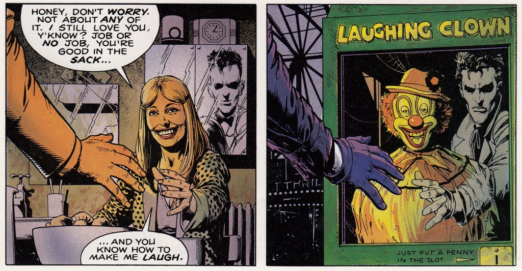
PARALLEL IMAGES are two panels that contain components identical to one another in composition, placement, and so forth. In the above example from BATMAN: THE KILLING JOKE, Brian Bolland has taken a direct copy of the last image from the past and brought it forward to the present with definable differences. You’ll notice that the woman and clown are both smiling and that an arm is extended out in both images. For application into our couple’s situation, the woman, in a right profile close-up, looks down sorrowfully at the counter, while her husband imitates her exact action in the next panel. Just as an aside, this effect also shows that his back is to her, as he can’t face his wife with the news.
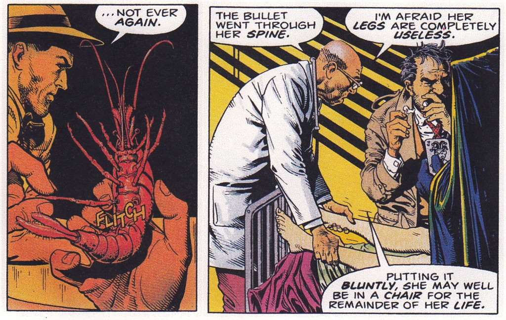
A SIMILAR CONCEPT introduces two different situations that are fundamentally and symbolically the same. In Bolland’s KILLING JOKE, we have a shrimp with its leg being pulled off followed in the next scene by Barbara Gordon having her legs being pulled. In both cases, the legs are no longer functional (she was shot in the spine and is now paralyzed). Our wife and husband share the same emotion, that of worry and fear. Though not tangible, we can experience it through both of their body language and facial expressions.
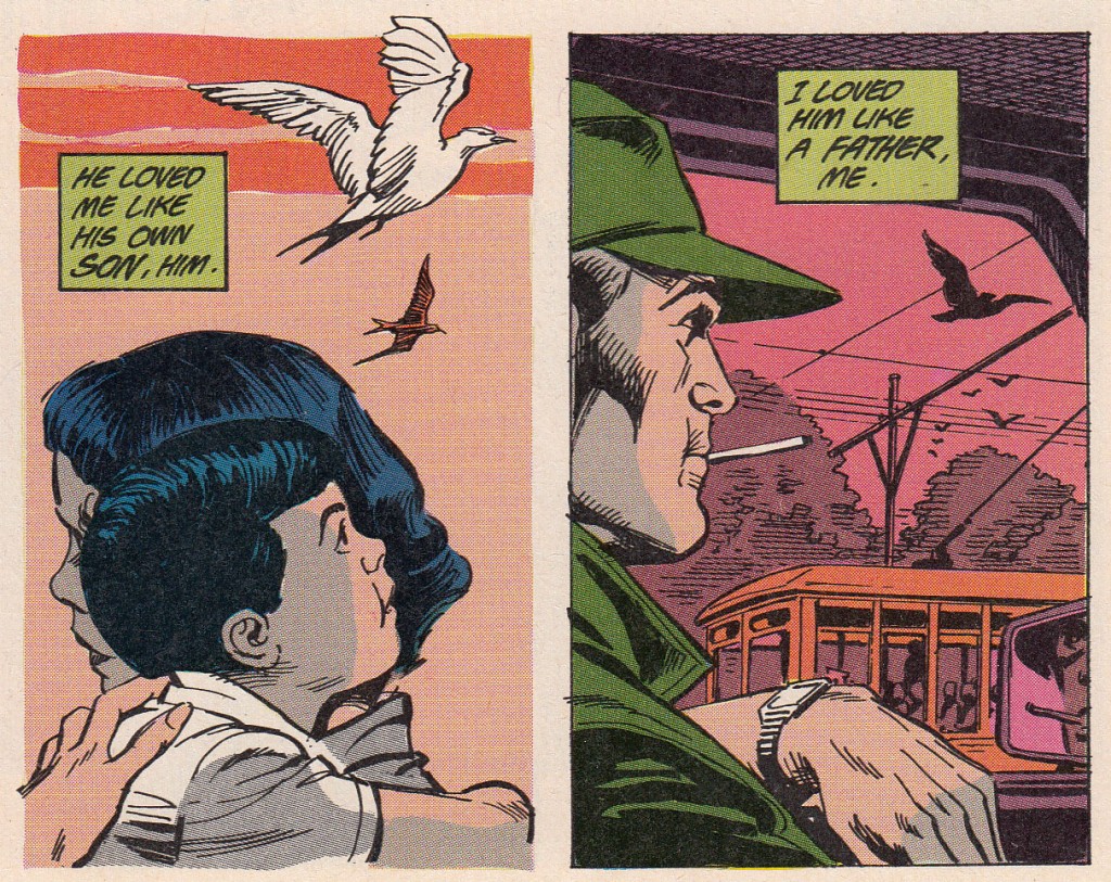
SIMILAR ELEMENTS consist of a prop, set piece, or even a backdrop that exists in both images, such as the flying birds in this piece from CINDER & ASHE. For our worried couple, a clock on the wall in the kitchen and one on the wall behind the counter in the bar both represent time, perhaps the same time, perhaps an extended passage of time. They don’t need to look the same, but should represent the same object and/or purpose.
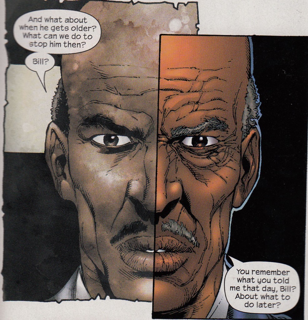
IMAGE COMPLETION allows the image from one scene to be completed by its immediate counterpart in the next scene. In this example taken from Marvel’s SUPREME POWER, Gary Frank shows the past and present versions of a general with a split-face version of himself. To make the difference in time period even clearer, he’s made the past tense panel border different than that of the present. Our troubled pair, on the other hand, may have the wife raising her glass to ask her son for a refill, while the husband does the same thing to the bartender. Her body and extended arm starts the transition and the balance of his arm and hand with the glass ends it to show the same action being performed by both.
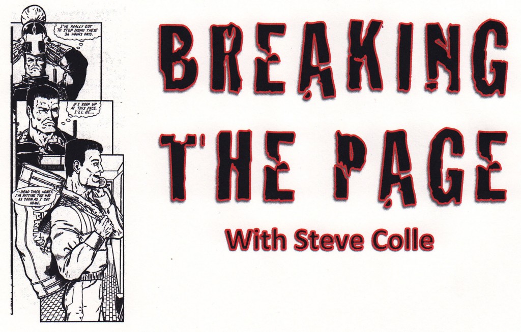
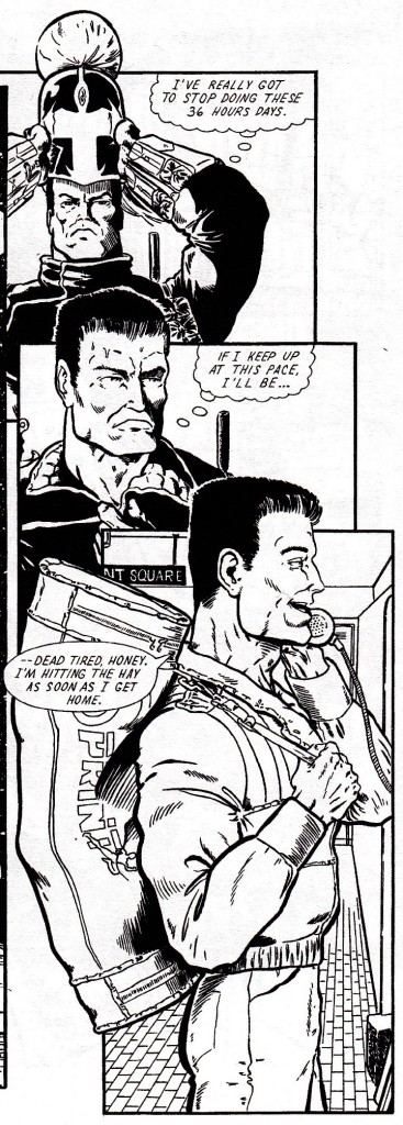
MOTION COMPLETION has an action start in one scene and continue or end in the next. This can be a physical action on the part of the subject or it could also be a movement of the camera, such as a shot taken from the front, then the side of the subject in the present, and a rear shot taken in the past. In this example from a title I wrote in 1993, the hero has just ended a long night. He looks at the camera, turns slightly, and suddenly he’s at a phone booth. Our wife could be bringing her glass up to her mouth and her husband has it at his mouth drinking already.
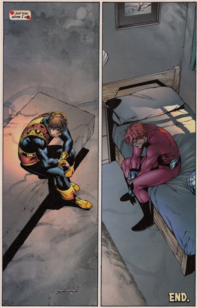
MIRROR IMAGES have the subjects of both scenes as polar opposites of each other. In this page from AVENGERS, we have both Jack of Hearts and Ant Man sitting on their respective beds (JoH is radioactive and can’t be around anything or anyone), both feeling very much alone and hopeless. Even though it isn’t exactly a mirrored imaged, it covers the bases. We could have similar shots of the woman and man, even going so far as to take the visuals from our Parallel Images example and turning them to face each other.
FADES, BLACKS AND LIGHTS can be used through a sequence of three panels or simply with two, depending on what the intention is. Instead of using a visual example, allow me to give a sample from an unpublished script I wrote a number of years ago. In it, I had a hostage situation where Captain America walked into the building without his shield, as per the demands of the hostage taker. Once stepping through the doorway, he was clocked in the back of the head with the butt of a rifle. Black. On the page turn, the first three panels showed a fading in effect as it went from black to faded to clear, where Cap was now tied up. Another example comes from another unpublished script of mine featuring the X-Men, where the team, including Jean Grey, are flying across the ocean in the Blackbird at night. Everyone is calm and Jean is falling asleep. Fade to black. Turn the page and there’s suddenly a blinding bright light that, as we look closer, we can see the figure of Dark Phoenix approaching slowly in a hovering pose. To attach the effect to our couple, the wife goes to bed and turns off the light in the kitchen. Black. Turn the page and we have a man’s hand reach for a light switch and turn it on. It’s the man coming home.
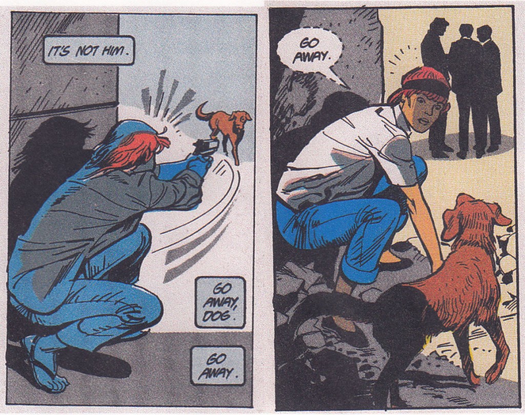
Finally, TEXT is an excellent way to bridge the gap between scenes. There are actually five ways to manipulate or apply words: 1) Through a direct continuation of a sentence of text that can apply to both the closing and opening scenes, 2) through a continuous line of dialogue that changes expected direction by the second scene [Ex. If I keep up at this pace I’ll be — and — dead tired, honey. I’m hitting the hay as soon as I get home. ], 3) through a dialogue that leads into a visual of the next scene or situation it refers to, 4) through using a word or phrase that applies to both scenes [such as the visual example above with the woman and the dog in present and past tense] and 5) through a key word or phrase that can have a double meaning. For our wife and husband, she heads off to bed by walking through the kitchen doorway and he walks out of the bar through the door, saying simultaneously to the absent other person, I’m sorry.
You probably noticed that in a few of the visual match cuts, there were examples of textual matches as well. You can definitely combine picture and word to enhance the effect of the flow, but it isn’t always necessary. You be the judge.
As you can see, there are a lot of options to choose from when you want to create a smooth transition between scenes. All it requires is a bit of thought and creativity. The next time you read a comic, look for these types of seamless flows in the story, and if you’re using match cuts in your own work, play around with the possibilities.
On a side note, three of our other ComixTribe board have tackled this topic at different times in completely different manners than what I’ve done here. You can find them in Tyler’s COMIX COUNSEL: MASTERING THE MATCH CUT, Yannick’s POINTS OF IMPACT 20: PLAYING WITH MATCHES, and Steven’s BOLTS & NUTS 109: TRANSITIONS. We may have distinctive ways of teaching it, but it all comes down to the same idea: To give you, the readers and creators, a different perspective on a very effective tool in the arsenal of the graphic narrator.
We’ll meet again next month for another look at ways to break the comic’s page.
Related Posts:
Category: Breaking The Comics Page, Columns

