BTP: Emmanuel Xerx’s DAREDEVIL Sequential Pages
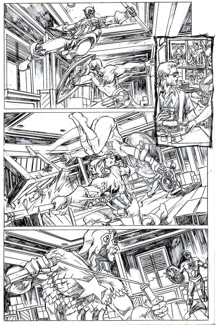
Welcome to our second BTP assessment, as this time we have sequential pages by Emmanuel Xerx, who has worked from a DAREDEVIL script written by Mark Waid and originally drawn by Paolo Rivera. These pages bring us the battle of the century between the Man Without Fear and the Sentinel of Liberty, Captain America. Let’s see how Emmanuel did in capturing the essence of the characters.
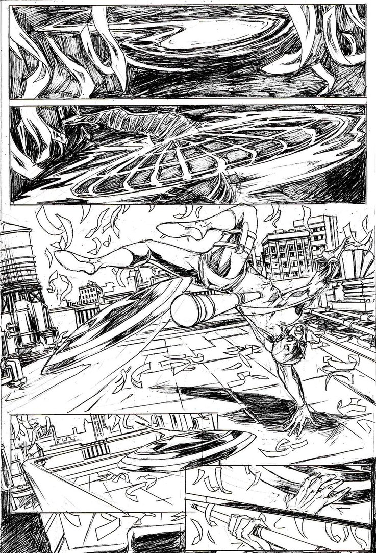
What I like? The page design is quite effective, especially the bottom two panels, where one gloved hand catches the shield and the other catches the club, with the assumption that the heroes are catching their respective weapons.
What I don’t like? There is a lot that doesn’t work:
Panel 1: A– Captain America’s shield doesn’t move through the air like a flying saucer zig zagging back and forth, but rather is thrown in a straight line; B– Look at the size and distance that it has already travelled, indicating that it was thrown from far away.
Panel 2: Cap is just in the process of throwing the shield now, meaning it didn’t travel the distance you’ve shown in Panel 1. How could this have been better presented? By role playing the panels’ actions. You have the shield speeding towards Daredevil in Panel 1 and then even closer in Panel 2, so where does Cap come into view? Is he realistically as close to the camera as you’ve presented? Probably not. Role-play your actions for more realism.
Panel 3: A– The shield comes in straight and suddenly makes a sharp turn, curving before it reaches Daredevil; B– Look at the angle of the shield as it’s being thrown in Panel 2, which is on a completely opposite angle in Panel 3; C– Daredevil’s body is turned on too strong an angle for how he has thrown the club, which would actually head off panel to the right, completely away from Cap; D– Look at the length of DD’s club in this panel vs. the length shown in Panel 6, which looks to be longer.
Panel 4: The shield is straight and level as it ricochets off the corners of the rooftop, so why wasn’t it straight in previous panels?
Panel 5: It looks like the shield is barely caught as it flies by the open hand. Here’s where you could have had the hand on the right in the panel and the shield coming in from the left, which would have mimicked the shape of the panel frame.
Panel 6 is pretty solid.
PAGE TWO/THREE (Double page spread)
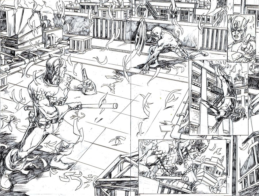
What I like? Again, your page design is pretty good, with nice eye flow from Cap to DD to Cap (Panel 2) to DD (Panel 3) to Cap again in Panel 4 looking towards the bottom right corner. Very nice. The other thing I like is the fact that Cap is in the foreground as the attacker and DD is in the background on the defensive.
What I don’t like? Okay, here goes:
Panel 1 (the main image in this spread): A– Look at the length of the billy club, which is now a full on staff (how did that happen?); B– Captain America’s stance looks ridiculous and unlike any martial arts position I’ve ever seen, with the staff against his left side (neither defensive nor offensive) and his left hand has two fingers up with the palm in instead of arm outstretched, all fingers up and palm facing out towards his opponent similar to a halt sign.
Panel 2: I think it’s fine image-wise, though probably smaller than it should be.
Panel 3: Just how far away from the building can Daredevil do a backflip? It seriously looks like he’s done a backwards flip about 20 feet away from his base. Seriously?
Panel 4: Look at the position of his hand on the staff compared to how it looks in Panel 1. It wasn’t centered to begin with, but now the long end is shorter. Consistency.
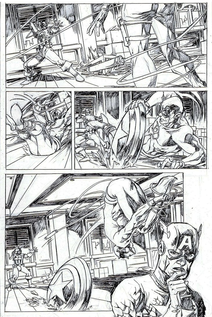
PAGE FOUR
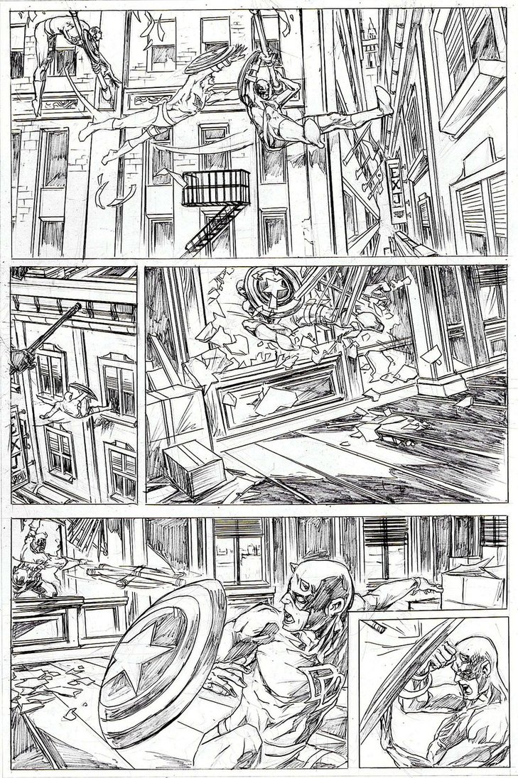
What I like? Consistently, your page design, all the way down to the small panel in the bottom right corner.
What I don’t like? This is becoming a bit of a habit, but
Panel 1: Daredevil’s motions as he swings from one flagpole to another are very awkward. First off, how did he go from a backflip to being in his first position? It should be opposite what you have here. Second, is he going over the flagpole in the first position? That’s the only way he would end up outstretched and reaching for the next. Finally, look at both of his arms and their positioning on the pole, one over and the other under. Why? That is completely implausible and, not only that, but it also lessens his momentum substantially, like he’s trying to stop himself.
Panel 2: This panel isn’t called for in the script and there’s a reason why. It has completely stopped his momentum in his swing towards the window. Notice the distance he has to travel to reach the window in Panel 1, and now look here. All you’ve done is stopped a moment in time to show that Cap isn’t far behind. Completely unnecessary and shouldn’t have been installed into the page design. To top it off, how long is the billy club now? We don’t know, but we’re about to find out.
Panel 3: No issues. You used a nice tilt shot to show imbalance as he crashes through. Good job.
Panel 4: How long is the club? It looks pretty short. The other problem is the way Cap has thrown the club, in a boomerang throwing style from the side. This makes the stick twirl in a circle, so when it hits, it could be on the flat side or on it’s tip or anywhere in between. Why didn’t he throw it in a straight line, tip first? That way you’d be assured that it would hit the way it did in Panel 5.
What I like? The shape of your second panel, to show its scene isn’t part of this one. I also like, for the most part, your choreography of the fight.
What I don’t like? The way you have the second panel seemingly sitting there like an afterthought to begin with. It would have been better served as a second of four tiers instead of off to the side like it is. But let’s go in order, shall we?
Panel 1: How did Cap get the billy club back? And why is it long again?
Panel 2: Fine except for placement.
Panel 3: The lack of necessity for showing Daredevil in his landed position. Keep the action to the two bodies in battle.
Panel 4: Nice shot, nice angle, nice action. But here’s where we have to question the length of each end of the nunchuk.
What I like? Captain America’s pose as he entangles DD in the first panel and the open image of Cap in the bottom right corner.
What I don’t like? Finally, to the last set of faux pas’:
Panel 1: There is a lot of slack on that line for Cap to be that accurate with the end wrapping around the legs so conveniently.
Panel 2: No issues.
Panel 3: Two things that don’t make sense, all to do with the shield. One, DD is pushing the shield down into the floor with his hand instead of maintaining it across his forearm to gain the momentum needed to make that kind of hole. Two, the shield is slammed into the floor on DD’s side instead of at his head, which wouldn’t stop him from being pulled backwards. Role-play.
Panel 4: Where did all that slack come from again? How did it get pulled from Cap’s grasp with that much leeway? Also, it looks as though DD’s hands were tied along with his feet, the way he’s reaching under the rope to free himself.
A lot wrong with these pages storytelling-wise. There’s no consistency in the length of the club, action motions aren’t planned out or role-played (even in your mind’s eye) for accuracy, and you’ve stopped action in a moment-in-time fashion ineffectively. Though I like the art style, the storytelling simply stops the sale of your abilities in these samples. I’m anxious to see what else you can come up with and look forward to possibly assessing more of your pages in the future. Thanks Emmanuel. And thank you, dear readers, for spending this time with me. I hope you learned something in the process.
Click here to visit the forum.
Related Posts:
Category: Breaking The Comics Page, Columns

