
B&N Week 122: Lettering Pt 2
Tuesday! Been frothing at the mouth for this week. No introduction beyond this. Let’s get to it.
We’re still talking about lettering. Last week was an overview to get you started, and this week, I wanted to get into the Bolts & Nuts of some certain things you’re going to need in order to be a good letterer.
Again, as I said last week, you never, ever, ever, never ever, ever never, want to use Comic Sans as your font to use in your lettering. Let’s go a little further: almost all of the default fonts you’ll find in your computer programs are going to be unusable for lettering. I can’t think of one default font I’d use in a comic.
Okay, let’s get started. The first things we want to talk about are terms. Hopefully, some of this will seem familiar. Let’s talk about paper first. By paper, I mean the viewable image you’re going to see, generally on paper. Going from the outside in, we have the Trim, the Bleed, and the Live Area. The Trim is where the paper gets cut, the Bleed is where the art from the Live Area extends to the edge of the page, and the Live Area is the place where everything is safe.
Let’s talk about the Live Area and the Bleed. Anything put in the Live Area is safe. It will be seen. All of your lettering should be in the Live Area. No lettering should ever be in the Bleed.
The Bleed is the area between the Trim line and the Live Area. When you print your comics, plates often move. What this means is that, from copy to copy of a printed page, your Bleed can move, showing more or less art on an individual basis. If you put words in the Bleed, there’s the possibility that you could lose part or all of a word, which hampers legibility. Don’t do that to yourself. No lettering in the Bleed.
As I said before, your comic dimensions are generally going to be 6.875 X 10.5. The Trim line will be around 6.625 X 10.25, and the Live Area will be 6 X 9, which is exceedingly safe.
Let’s talk about some more terms before we talk about actually putting letters on art. Well, not terms, really, but what you’ll find both in and around word balloons and captions. This isn’t an all-inclusive list by any means. This is just what you’ll usually find on the comic’s page.
Uppercase and sentence case: Most of the lettering fonts you’re going to use will be uppercase, but there are some stories that use sentence case. It really depends on the look you want to go for. When I say most, I really mean overwhelming majority.
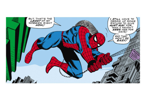
Uppercase word balloons [Also notice the I’s, both crossbar and not.]
Crossbar I’s. These are all over the place. My personal belief is that the crossbar I should only be used for personal pronouns and acronyms [and most of the time, not even acronym’s]. You’ll have some letterers that will start a sentence with it as well, and while not wrong, I’d ask for a change. Call it editorial prerogative. Most comic lettering fonts will have two separate I’s: one crossbar, one not.
Balloon tails. These should always point to a character’s mouth. I like tails that end in sharp points. I think they look better. The last quarter or so should come together to a single line, one that, again, points to the mouth.
The ellipsis are three periods in a row. Not two, not five, not more. Want to be taken seriously? Three, and only three. Generally speaking, they’re used as a pause. If the same character is speaking, they should end one balloon, and then start the next. This is a generality, not a hard and fast rule.
- Ellipsis, both at the end of one and the start of another.
Double-dash. This is used when a character is interrupted. Not a single dash, but a double.
Joined balloons: Balloons are joined in two ways. The first way is to join them balloon to balloon, and the second is to use a connector. Connectors are generally used when two characters are speaking one after the other in the same panel, and you need to space the balloons apart.
Butting borders: This is when a word balloon is up against a panel border and cropped. Want to save space? Put the balloon either at the top or in a corner somewhere. It keeps the word balloons up and out of the way most of the time.
Overlapping borders: The opposite of butting, this is used only when necessary. Personally, I despise seeing it. It looks terrible, and is rarely done correctly. Some tips: on even-numbered pages, don’t use it on the first panel. Also, try not to use it on panels along the left edge of the page. On odd-numbered pages, try not to use it on panels on the right edge of the page. Try to keep it to the middle and inside if at all possible.
Whispering: Traditionally, this is a balloon made up of dashes. [Remember, comics have a visual language. This is one of those.]
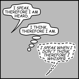
Speech, thought balloon, and whispering.
Breath Marks: Two stacks of three vertical dashes, usually coming before and after a sputter, cough, or the like. Put them together if the person has fainted.
The Asterisk is used at the end of dialogue in a word balloon to denote an editor’s note or something. Generally, that note will be found either in the same panel or the same page. Don’t put it at the end of the book like a footnote unless absolutely necessary.
Foreign languages have dialogue that begins with a greater than sign <, and end in a less than sign, >. The first balloon with the foreign language will also end in an asterisk. That asterisk should correlate to a caption with a note that explains what the language is.
Finally, let’s talk more about fonts for a little while.
You can’t do anything without a font. Well, you can, but you’d end up with empty word balloons, which can be effective, but that’s not what I’m talking about here. Like I said before, the overwhelming majority of the default fonts you have in your word processing programs and Photoshop aren’t useful for comic book lettering. You’ll need to find different fonts.
Where do you get them? Well, for those of you who are truly ambitious, you can create your own fonts. [After doing lettering for a while, you may become interested in this. It happens.] There’s a program called Fontlab that will help you create your own fonts. That’s all I’ll say about that. If you’re truly interested in creating your own fonts, there are books out there that will help you.
Back to the question of where to find fonts. A great resource is Blambot.com, created by letterer Nate Piekos. Nate has been lettering for years, doing work for all the major companies. Not only does Blambot.com have fonts, but also articles on the subject as well. Now, Nate has a plethora of great, free fonts, as well as a bevy of fonts you have to pay for. Every month, he adds two fonts to the site: one for free, the other for pay. Get all of the free ones, and any of the pay ones that you wish. (All of them?) All of them. Variety is the spice of life, and having variety also gives you flexibility.
You can also find fonts at ComiCraft.com. ComiCraft is a computer lettering company that made it big doing books for Marvel and DC, as well as others. They also wrote a book, Lettering the ComiCraft Way, that I suggest you purchase.
The fonts on the ComiCraft site are not free, nor are they cheap. However, every year, they have a sale for half-off on their fonts.
You can also do a search for downloadable fonts. These you may or may not need a license for. Check the files of the font before you decide to use these fonts in your comics.
Make two different libraries for your fonts: one for dialogue, and one for sound effects. Keeping these separate will make it easier for you when it comes to lettering. You don’t want to have a sound effect font for regular dialogue, do you? [This is a generality. It could very well be that you want to use one—just make sure you’re doing it for the right reasons.]
That’s all for this week. Next week, we’ll talk about using the computer programs, what the letterer is responsible for, and other fun stuff like placement, if it doesn’t run too long. Otherwise, placement will be the final installment on lettering.
Homework: go read some comics! You’re going to be looking for elements of style. Where and when crossbar I’s are used, breath marks, joined balloons, connectors, tails, and all the rest. Make notes concerning who the letterer is [or company], what the publishing house is, if there’s an editor or not [this is mostly for the indies and Image], and what lessons you’ve learned.
See you in seven.
Click here to make comments in the forum.
Related Posts:
Category: Bolts & Nuts, Columns


