
Before You Submit to Comixology Submit
 Last week, Comixology released a whopping 76 new comics through their Submit platform. Whether it’s because the nearly one-year old digital distribution channel is getting more submissions than ever, or because they’re simply playing catch-up from a backlog of titles accumulated over the holidays, that may be a record. I wrote about Comixology Submit when it debuted last March, and again more positively last December. Comixology has become the new news stand for comics, and for the first time ever, it’s a news stand with infinite shelf space. That’s an incredible opportunity for independent, small press, and niche comic creators. And yet, every week, I see creators failing at taking full advantage of the platform.
Take a look at the first 21 titles on the front of the Submit page last week:
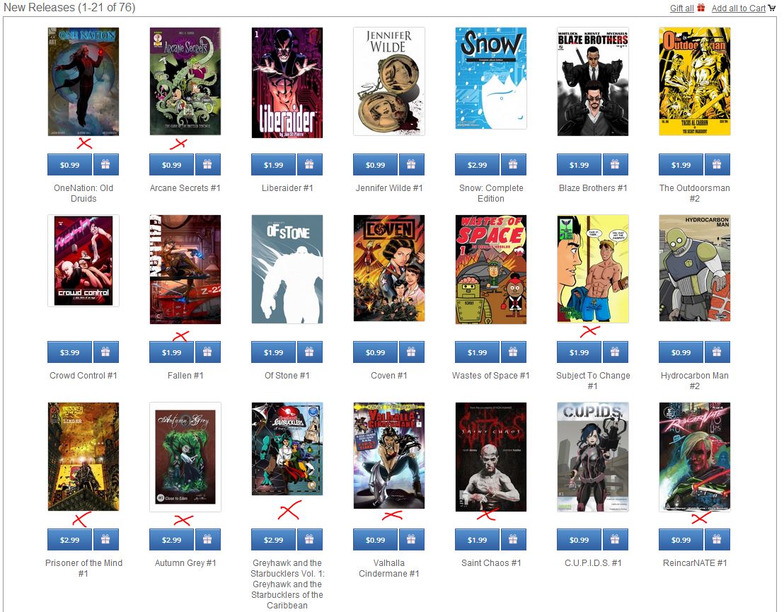
Click for Actual Size
I count at least ten covers with titles that are completely illegible. Whether it’s the font, or size, or placement of the logo, or the color combinations chosen, or some combination thereof, these covers aren’t doing the very first job of a cover…letting people know what the book is! Many covers also carry small, hard to comprehend images, that do absolutely nothing to help sell the book. And finally, some of these covers are from small press publishing companies…yet, I can’t make out a single logo or brand on the whole page.
Why does this happen?
My guess is that most creators are so damn excited to finally push their books onto the Comixology platform, that they’ve taken absolutely no time to think about how those books are going to translate to the screen real-estate Comixology provides. In haste, they just through up the covers they have…whether it is a good design for the platform or not. And that’s a big mistake.
Here’s another one I see all the time. This, another Submit line-up from a few weeks back:
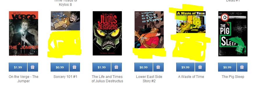
In this row of Comixology Submit books, three titles, on which I scribbled highlights in yellow, aren’t using all the real estate Comixology affords them for their covers. Why? Sorcery 101 is using less thatn50% of the space available, and has no logo at all. Lower East Side Story is a very odd size, and gives up the bottom fifth of its cover space for no good reason. And while A Waste of Time is legible, that cover is a waste of space.
 Now, I get it…some of you are making landscape style comics, or do horizontal strip webcomics. That’s fine. But Comixology’s platform isn’t going to change. They’re set up to display covers at standard US comic size. So why not use every inch they’re giving you, and create a cover image for Comixology that works?
Comixology is the BIGGEST SINGLE RETAILER OF COMICS ON THE PLANET right now. Surely it’s worth an hour or two of extra effort to make sure your cover is ready for prime time, no?
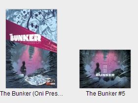
Look at how much better the Oni Press version of The Bunker looks than the Comixology submit version of the same book. One takes the platform in mind, the other doesn’t pay it any. (And yes, I know The Bunker is a big Comixology Submit success story. But trust me…the cover size wasn’t the reason.)
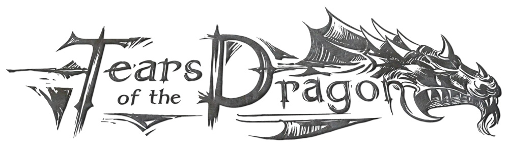
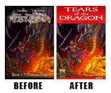
A few weeks ago, I submitted a few issues of my book TEARS of the DRAGON, a swords and sorcery fantasy comic I’ve been working on for a long while now. TOTD has a very cool, custom logo that was designed by my pal Andrew Jarvis a while go. It looks cool big, doesn’t?
But this is the actual size issue one would appear on the Submit platform:
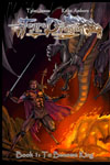
The image is blurry and too dark, and the logo is completely illegible. That dog ain’t gonna hunt.
So, I needed to create a new cover styling that will work for the Comixology platform.
Here’s what I did:
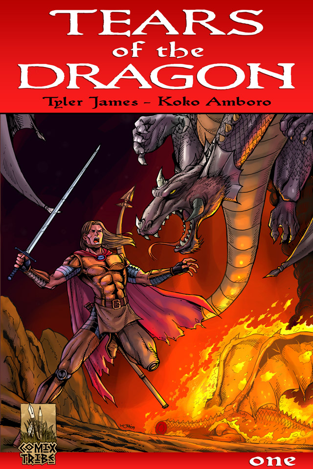
A few things:
1) I’ve noticed that white over color seems to stand out the best when it comes to titles popping on Comixology.
2) Most ornate, stylized logos pretty much suck at 100 pixels wide. So, I ditched the one I had, and went with something simple. Inspired design? Probably not. But functional for certain.
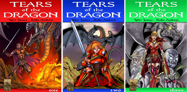
3) I gave some consideration to a consistently branded look for this series, so that ideally the repetition of cover style will make the series easy to recognize as I roll out new issues.
Gods gift to design? Surely not. Can and should you do better with your books? Of course!
But that little bit of extra effort has surely given me a cover that will work better on the Comixology Submit platform than the one I had, don’t you think?
Just a quick one for you today.
Next time, I discuss Comixology, I’ll probably dive into digital pricing strategies on that platform. But honestly, I need to collect more data before I’m comfortable speaking on that subject. Luckily, we’re only a few weeks away from another quarterly sales report.
“Before you Submit to @Comixology, read this @ComixTribe article!” (Click to Tweet)
Discuss!
In the ComixTribe Forums on Digital Webbing!
Keep Reading!
If you found this article useful, you may want to read one of these three articles next:
Comixology: Yes, a Game Changer
A Netflix for Comics? A ComicsFix Interview
Why Aren’t I Selling More Comics?
Related Posts:
Category: Comix Counsel


Comments (2)
Trackback URL | Comments RSS Feed
Sites That Link to this Post